×
Comprehensive overview of all features, functions and capabilities of the PaceMind Progressive Web App
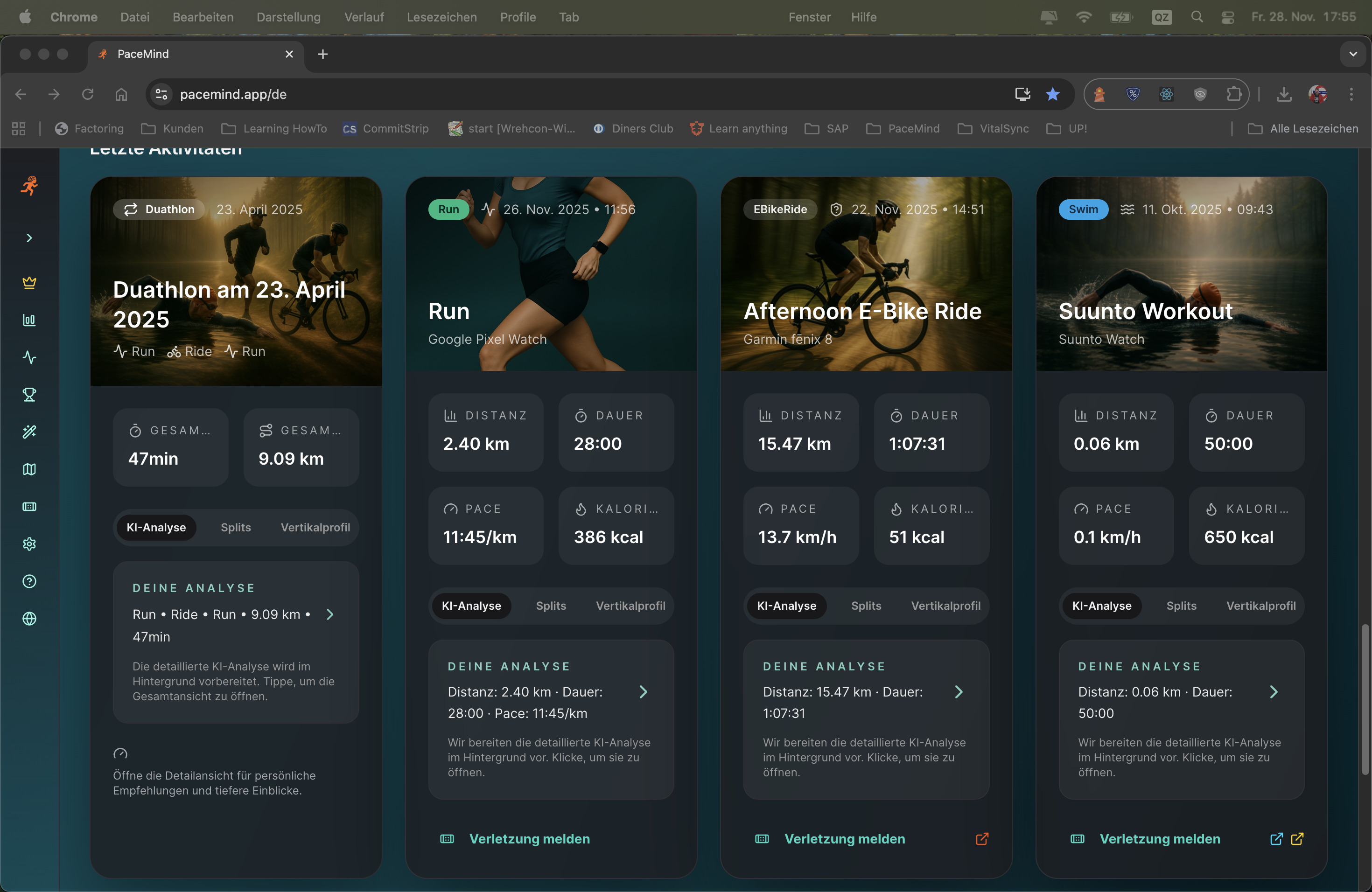
Your latest activities clearly displayed: Whether it's running, swimming, cycling, or multisport events – all your workouts are clearly structured and presented with the most important metrics.
Weekly overview after training:
You open PaceMind on Sunday evening and see your training week at a glance:
- Monday: 10 km run, 52 min, 5:12 min/km, 148 bpm avg HR (Polar)
- Wednesday: 45 km cycling, 1:48h, 25 km/h, 320m elevation (Strava)
- Thursday: 5 km tempo run, 23 min, 4:36 min/km, 165 bpm (Polar)
- Saturday: Triathlon event (1.5 km swim + 40 km bike + 10 km run) - Total 2:45h (Suunto)
Everything consolidated, deduplicated and clearly organized – without manual work.
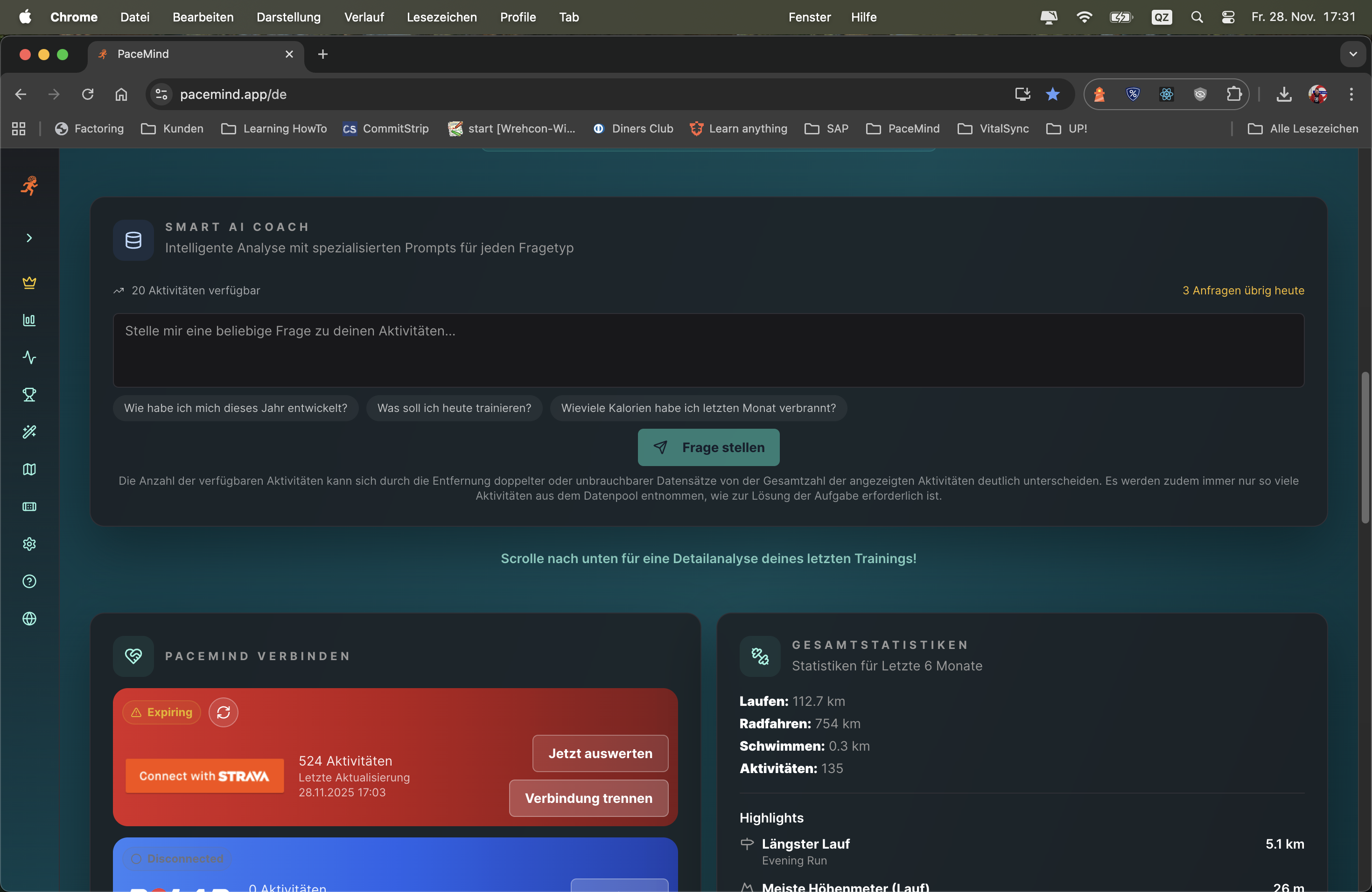
Your central training hub: The dashboard combines all important information at a glance – from current training load to readiness score, your latest activity and a personalized AI tip.
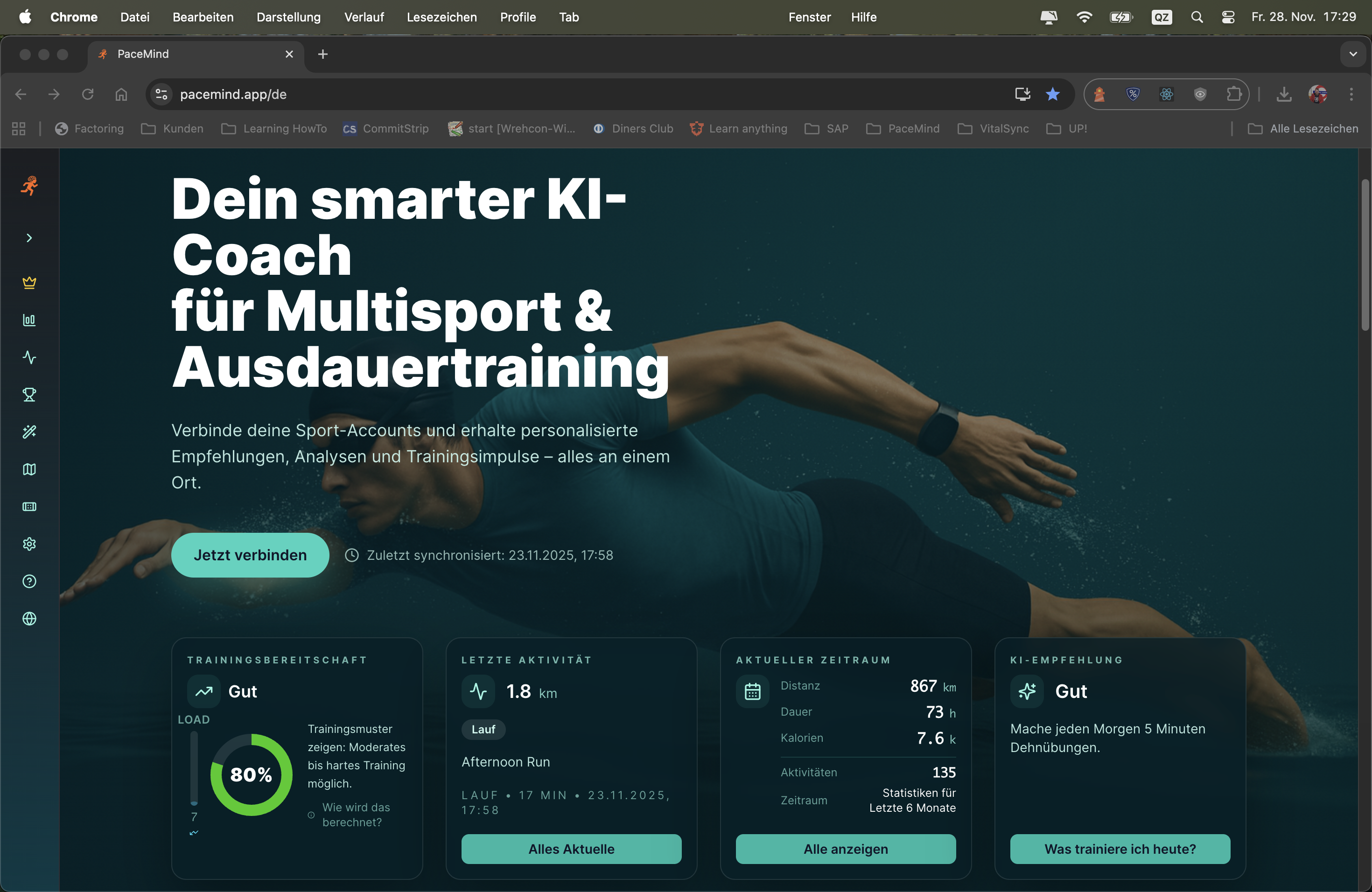
You open the app in the morning and see at a glance: Your training load is at 72 (high), your readiness score is 65 (moderate) – the AI tip recommends an easy recovery run. Your year statistics show 1,847 km in 142 activities. Your last activity was yesterday: 10.2 km in 52 minutes with an average pace of 5:06 min/km.
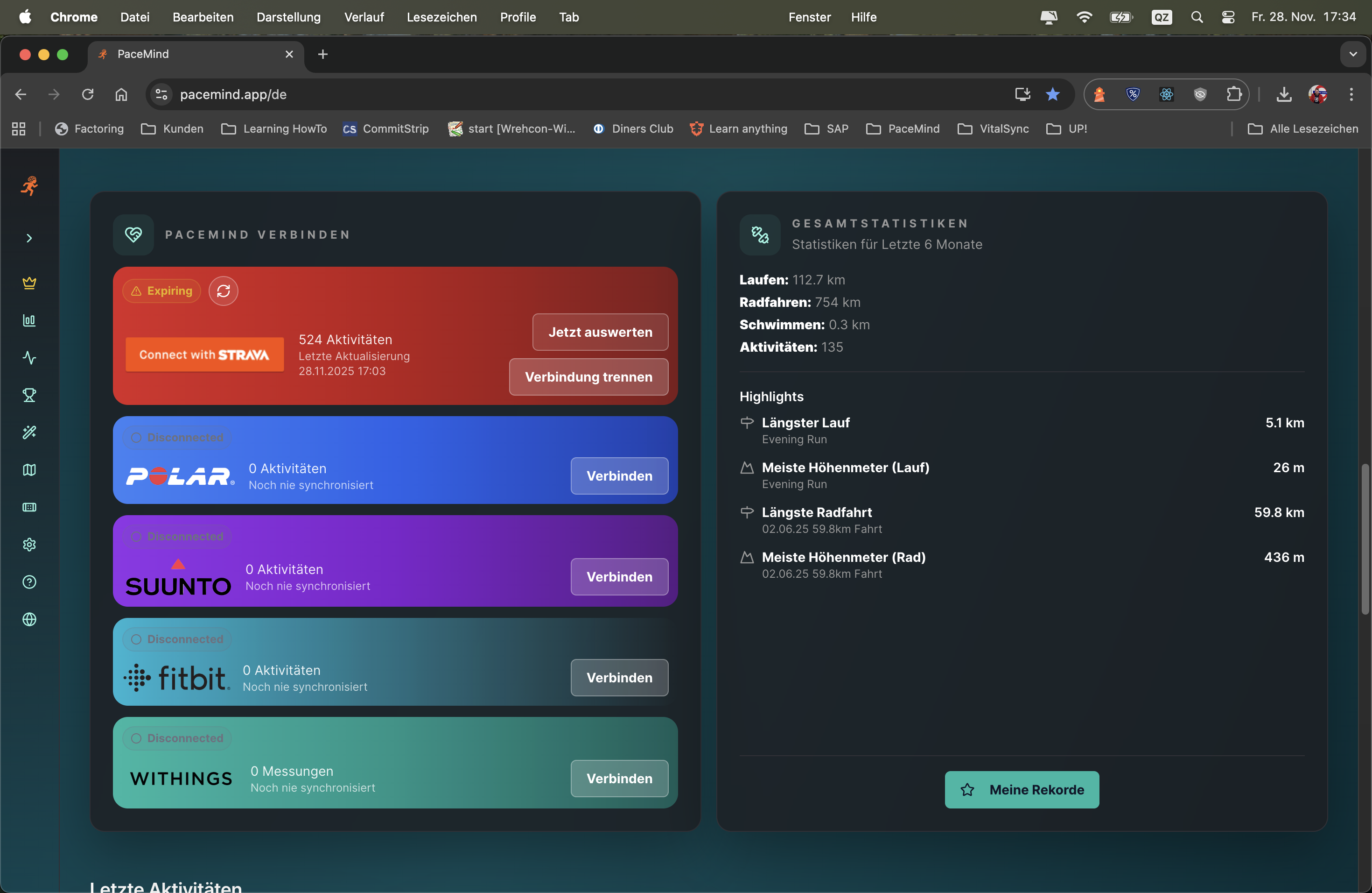
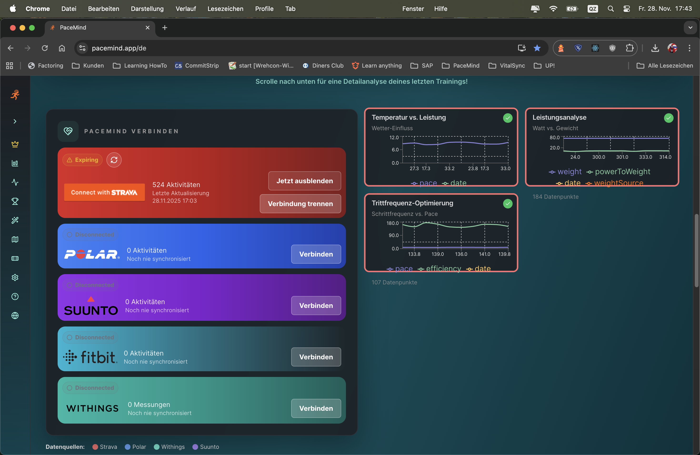
Platform independence matters: That's why the 6 most important providers are integrated in the PWA – Strava, Polar, Fitbit, Suunto, Withings and Garmin.
No duplicates thanks to smart filtering: If you use multiple devices simultaneously, the data is intelligently merged. PaceMind automatically recognizes when it's the same workout and consolidates the information into a complete picture.
Combine data sources for new insights: Link your sleep and weight data from Withings with your training data from Polar – and discover completely new connections between recovery, body weight and performance.
Scenario 1 - Multi-Device Training:
You go on a long bike ride with your Garmin Edge (bike computer) and simultaneously wear your Suunto watch. Both devices record. PaceMind recognizes: Same time, same distance, same activity → Consolidates into one workout. The best metrics from both devices are combined (e.g., power from Garmin, precise HR data from Suunto).
Scenario 2 - Platform Switch:
Monday: 10 km run recorded with Polar Vantage → saved on Polar Flow.
Tuesday: 8 km run recorded with Garmin Forerunner → saved on Garmin Connect.
In PaceMind: Both runs appear seamlessly in your activity list, fully analyzed, without gaps.
Scenario 3 - Cross-Platform Insights:
You track your sleep with Withings (sleep tracking), your weight also with Withings (smart scale), and your runs with Polar. PaceMind combines this data: "After poor sleep (<6h), your pace is on average 15 sec/km slower" or "Since you lost 2 kg, your average HR has dropped by 5 bpm".
Gratisdom: You're not tied to one manufacturer. Try new devices, keep your old ones – your data remains consistent.
Best-of-Breed: Use the strengths of each platform – Strava for social features, Polar for training analytics, Withings for health metrics.
Future-proof: If you switch to another watch in 2 years – your history remains completely preserved.
Completeness: Some activities are automatically synchronized across multiple platforms (e.g., Polar → Strava). PaceMind recognizes this and shows you a clean, deduplicated picture without manual work.
The analysis considers your complete profile and external factors:
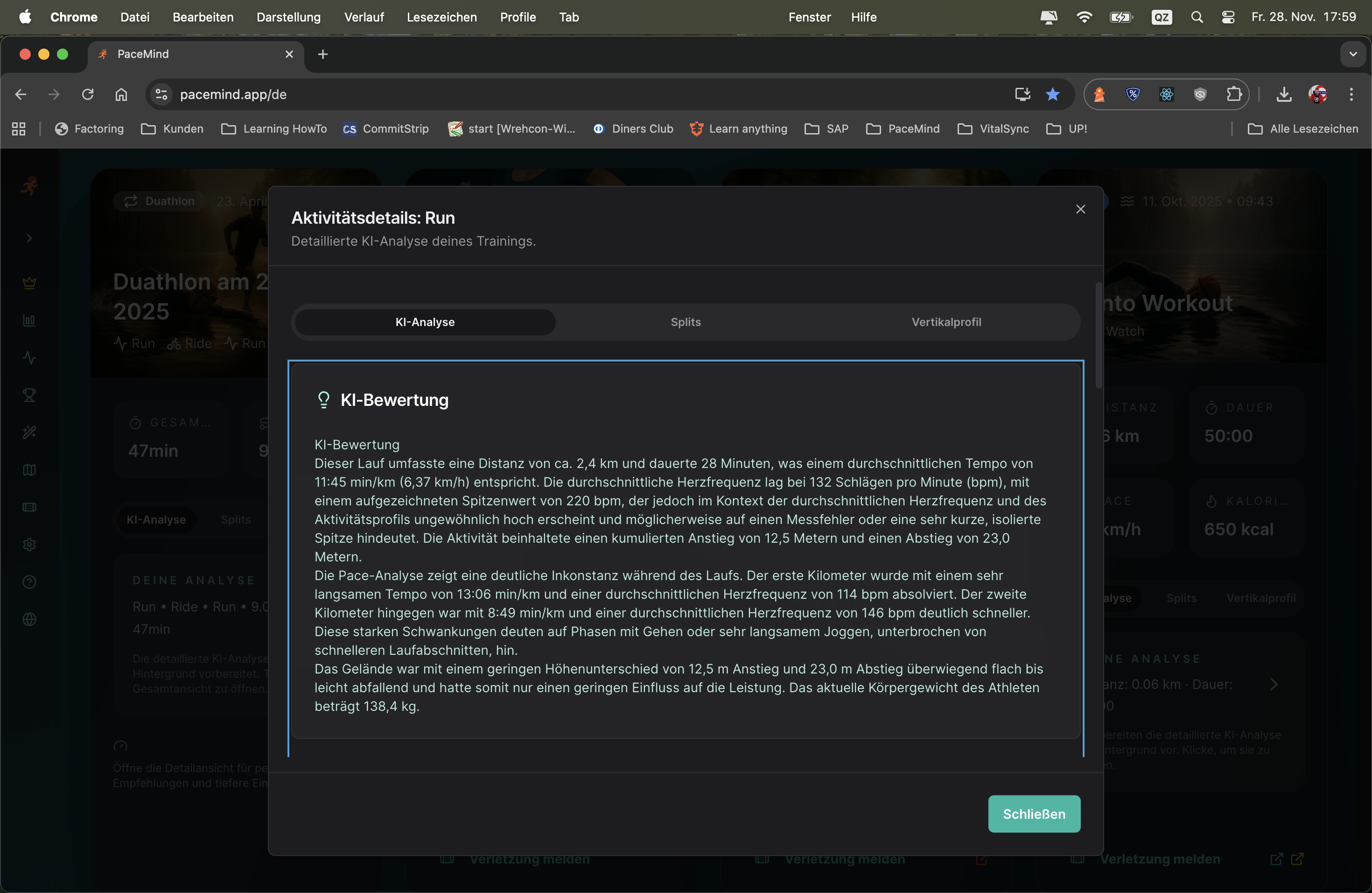
It feels like you're really getting feedback from a trainer: In addition to a thorough and meaningful AI evaluation that doesn't just flatly repeat the data, it also considers your fitness level, your goals, your route and even the weather, and recognizes training breaks.
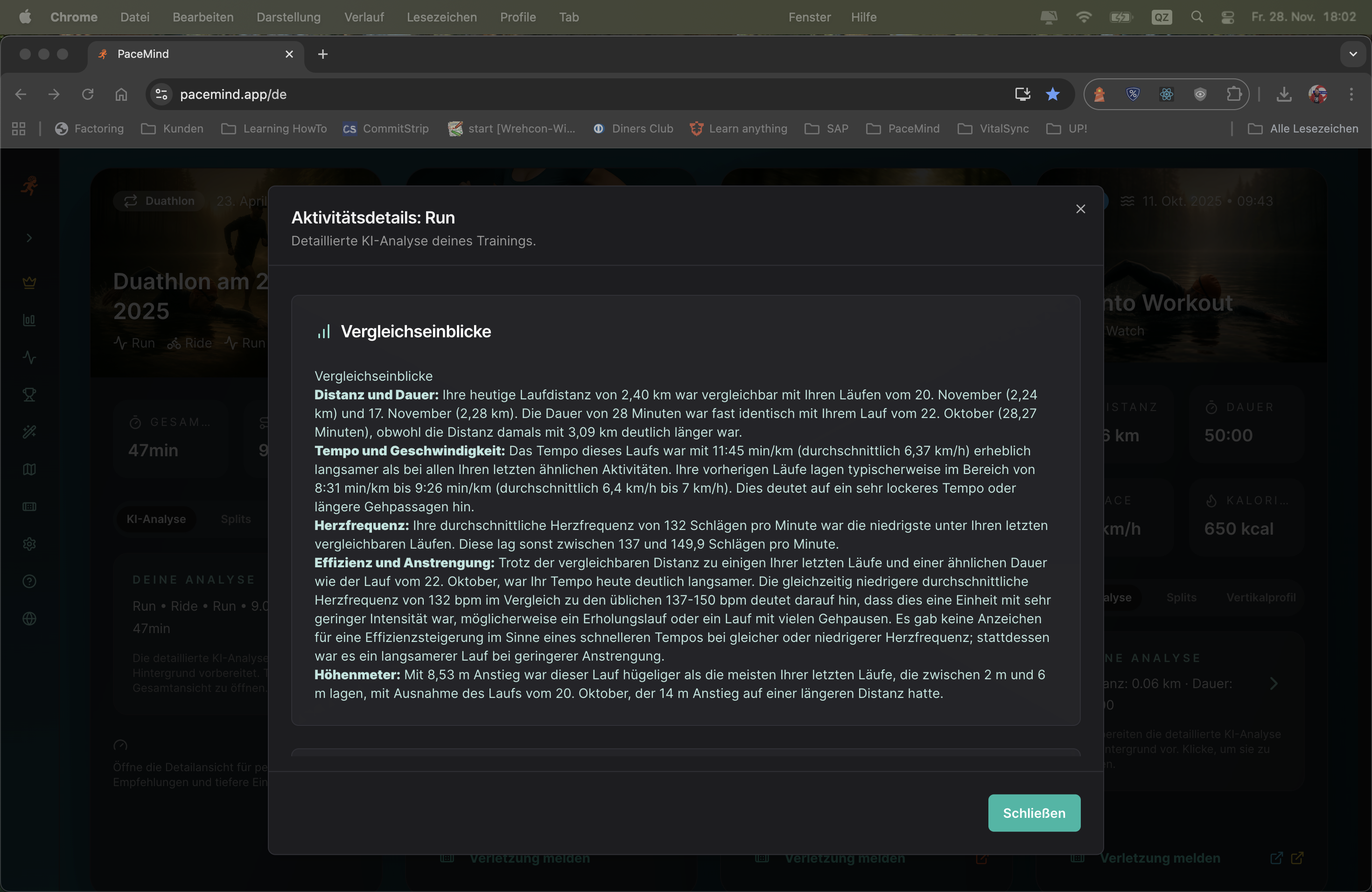
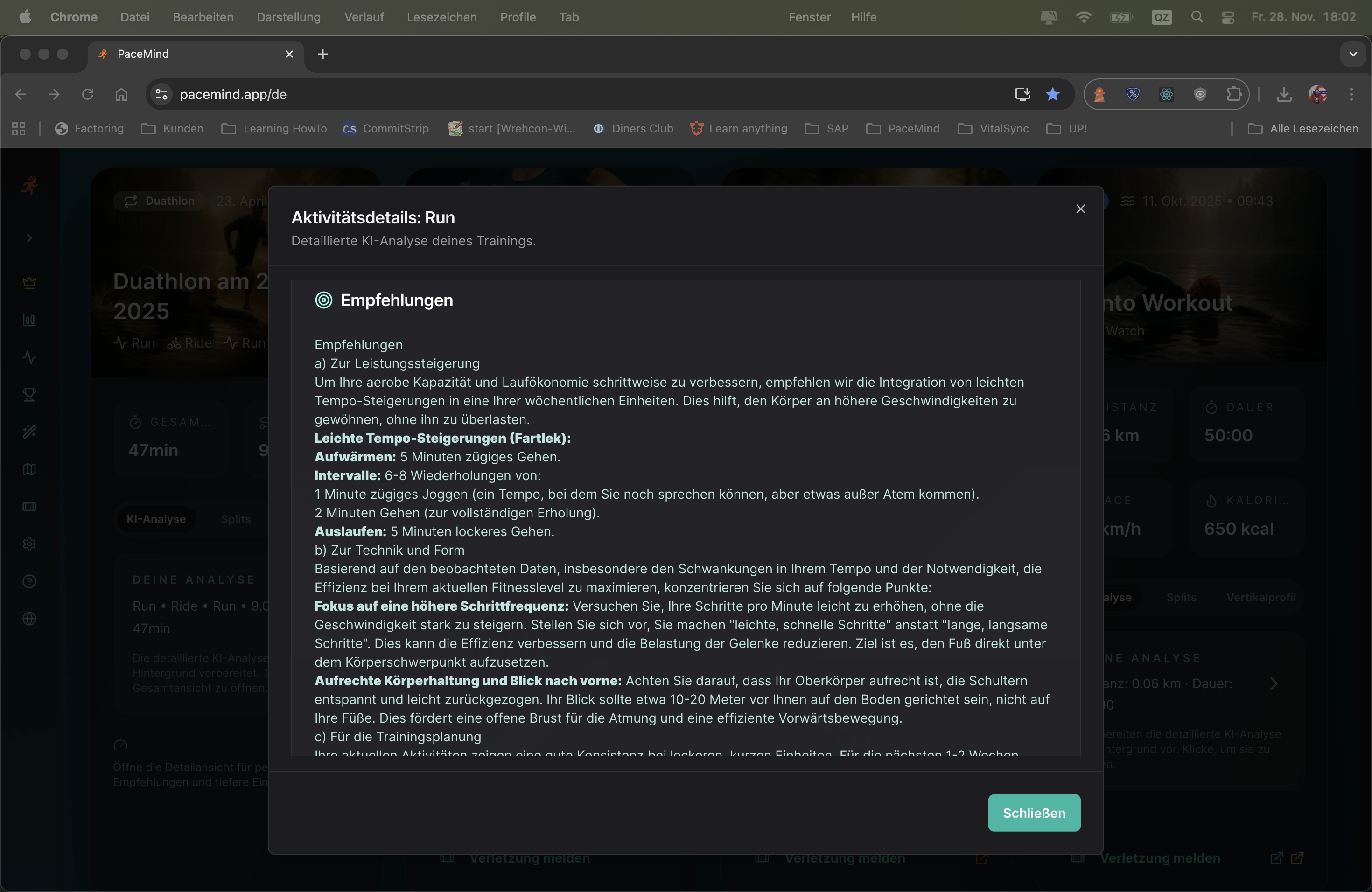
The analysis is complemented by: A performance chart, a thoughtful comparison to your recent training sessions, and concrete recommendations on what you can improve. As mentioned – it feels like your real coach.
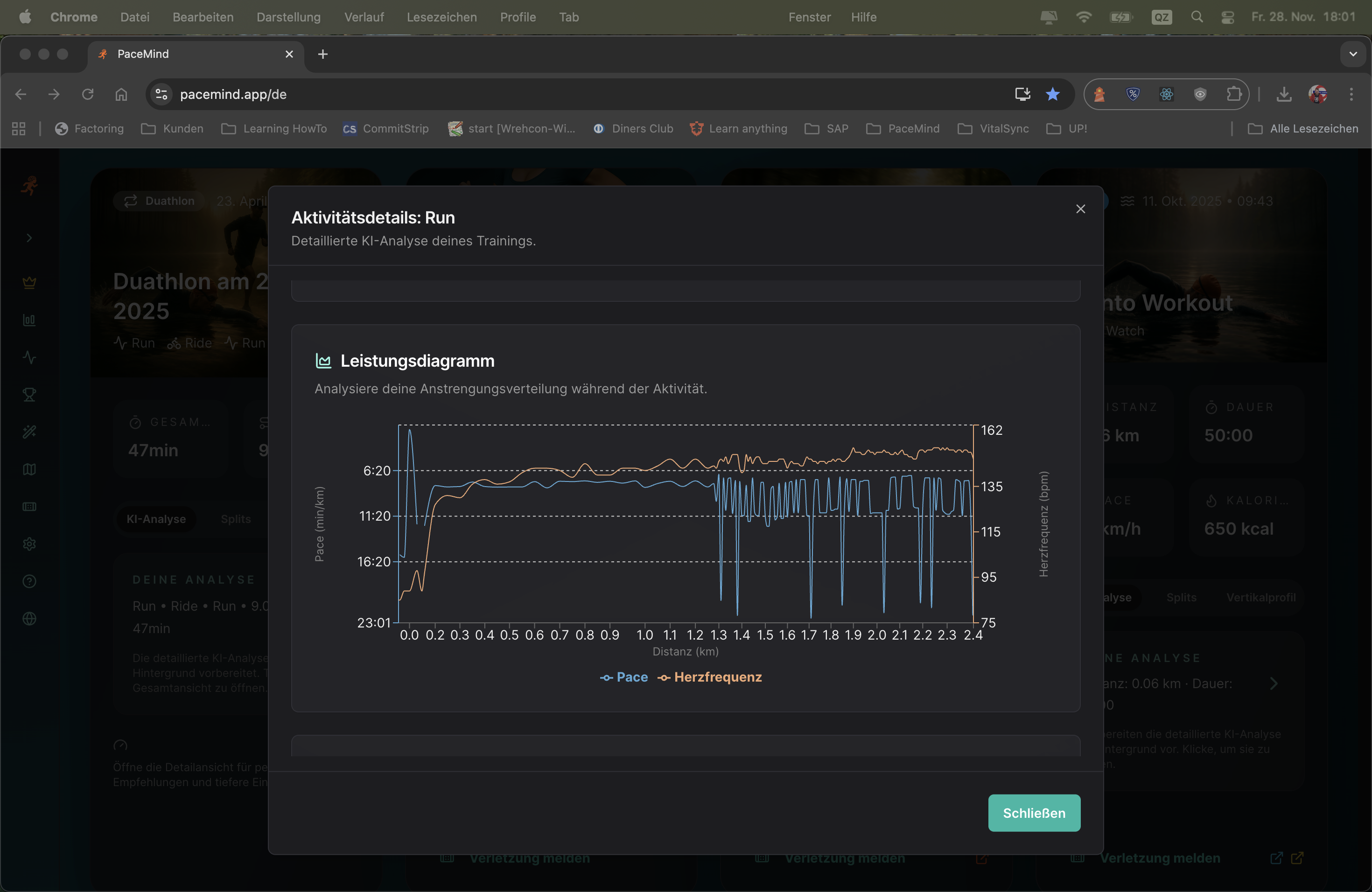
Performance chart and comparison with previous workouts:
Concrete recommendations for your next workout:
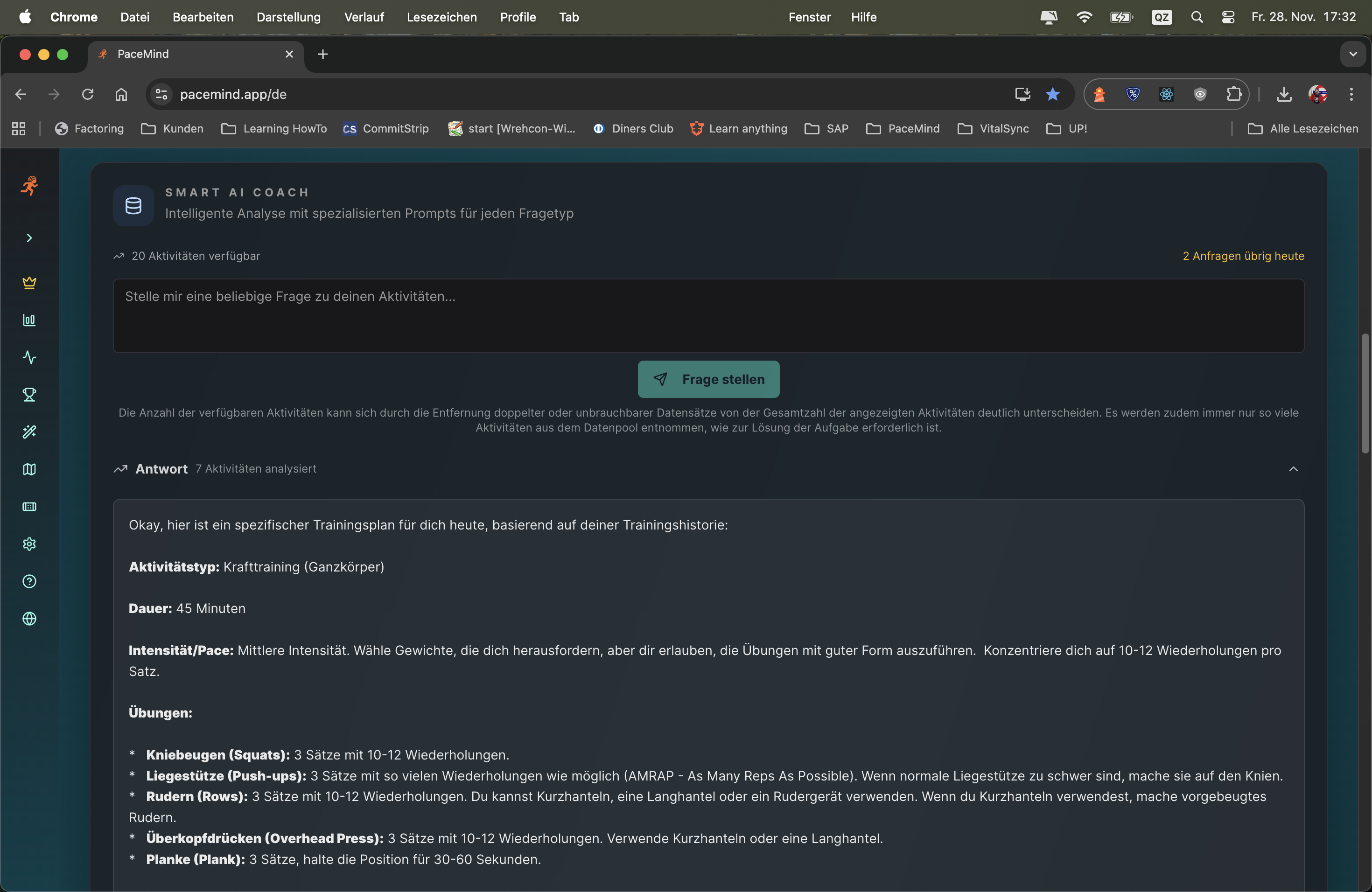
Your activity: 10 km in 52 minutes, average pace 5:12 min/km, avg HR 158 bpm, 120m elevation gain
What the AI analyzes:
"Good run today! At 5:12 min/km you're 8 seconds faster than your 10k average from the last 4 weeks – despite the 120m elevation. That shows clear progression.
Notable: You started the first 3 km at 4:58 min/km – significantly faster than your target pace. Between km 4-7 your pace dropped to 5:25 min/km. That's a classic sign of starting too fast. Your heart rate in the first 3 km was already at 168 bpm (Zone 4) – too intense for a long run.
At km 6 you had a 90-second pause (probably traffic light or drinking break) – this is correctly removed from the pace calculation.
The weather today at 28°C and 75% humidity was challenging – under these conditions your performance is all the more impressive. For heat training you should run 10-15 sec/km slower.
Recommendations for next time:
Context instead of numbers: The AI doesn't just say "You ran 5:12 min/km" – it says "You're 8 sec faster than your average, DESPITE 120m elevation and 28°C". That's the difference.
Pattern recognition: A good trainer recognizes when you start too fast. The AI does too – through split analysis and HR zone monitoring.
Personalization: The analysis adapts to your level. A beginner gets different tips than a sub-40-min 10k runner.
Actionable insights: No vague advice like "run faster" – but concrete numbers: "Start 15 sec/km slower", "Keep HR at 150-155 bpm".
Empathy: The AI praises when it was good ("Good run today!"), and explains understandingly with problems ("At 28°C that's all the more impressive").
Just ask what you want to know: The Smart AI Coach answers all questions about your training – whether it's "When was I fastest?", "How many kilometers did I cycle in October?" or "What was my highest pulse?". And the best part: You get personalized training suggestions exactly when you need them.
No rigid framework, but flexible intelligence: No fixed training plans like "Monday you must do this, Tuesday that". Instead: "I have time and motivation today – give me a good suggestion!" The AI analyzes your data, your current form and creates the perfect training suggestion for exactly this moment.
Ask your question in natural language – the AI understands you:
Scenario 1 - Statistics Question:
Question: "How many kilometers did I cycle in October?"
Answer: The AI analyzes all October activities (cycling), sums up distances, compares with previous months and gives additional insights (e.g., "That's 23% more than in September").
Scenario 2 - Training Suggestion:
Question: "I have 60 minutes today – what should I train?"
Answer: The AI checks your current training load (e.g., 72/100), your readiness score (e.g., 65), your last activity (e.g., hard run yesterday) and suggests: "Easy 8 km run with pace 5:30-6:00 min/km, HR Zone 2, for active recovery. Focus on even tempo."
Scenario 3 - Performance Analysis:
Question: "When was I fastest?"
Answer: The AI finds your fastest activity, shows pace, date, conditions and compares with your other top runs. Plus: "That was under optimal conditions – you could achieve that again in similar weather."
Traditional training plans tell you: "Monday 10k tempo, Wednesday intervals, Saturday long run." But what if you're tired on Monday? If the weather doesn't fit? If you have spontaneous time?
The Smart AI Coach adapts to YOU: It knows your current form, your load, your availability. You ask when you want to train – and get the perfectly tailored suggestion. Flexible, intelligent, without pressure.
Depending on the data source and available metrics, different chart options are offered:
What good is the best data if you can't understand it at a glance? Depending on the source and data quality, you get charts with appropriate analyses on request – and you can even pin them permanently to the dashboard.
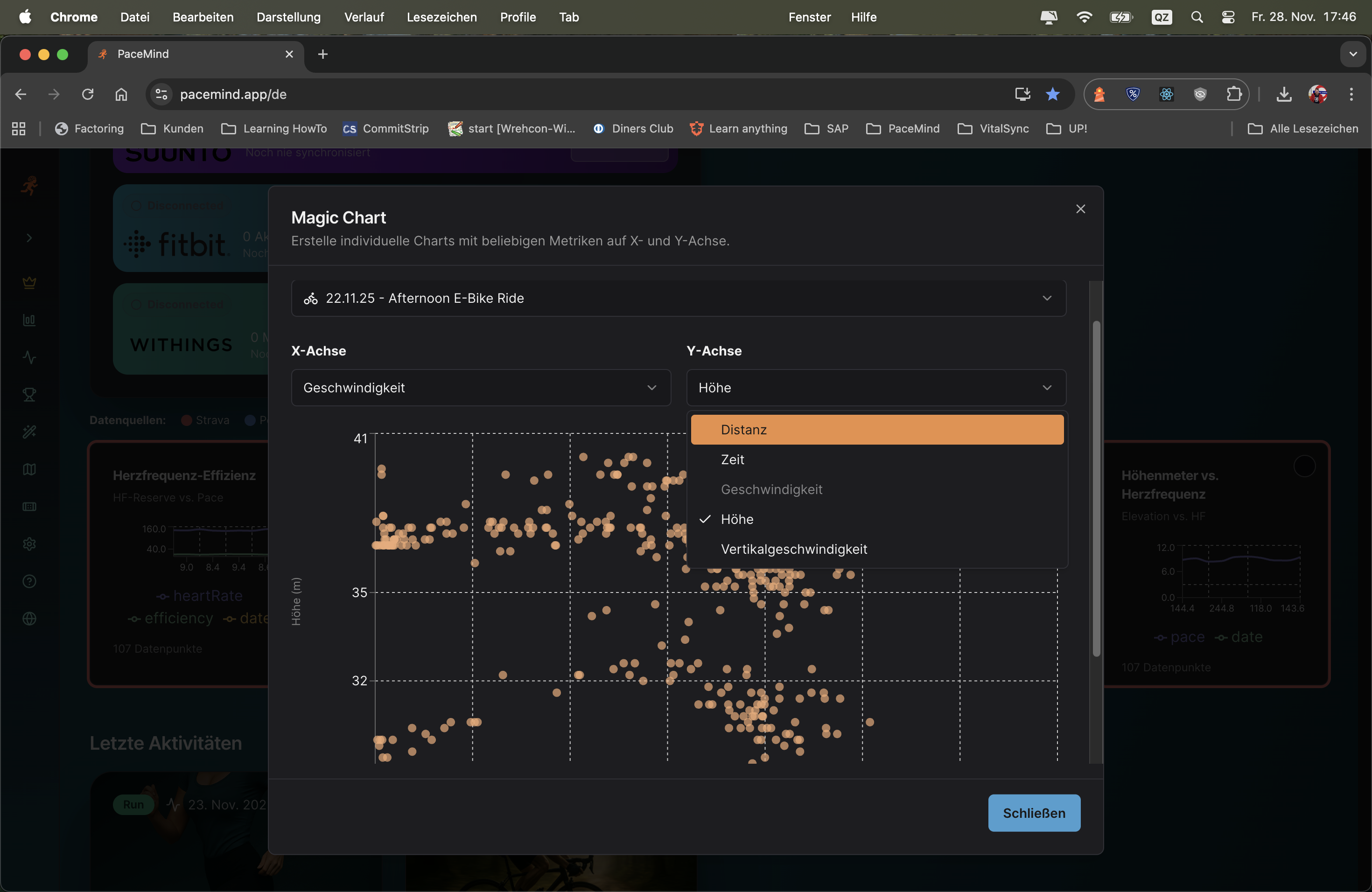
Magic Chart can do even more: Take any workout and build the info chart you really want with 2 mouse clicks. Pace over time? Heart rate vs. elevation? Cadence analysis? You decide!
Pin charts from platforms: Charts generated from your connected sources via "Analyze now" can be pinned to the dashboard – for quick access to your most important metrics.
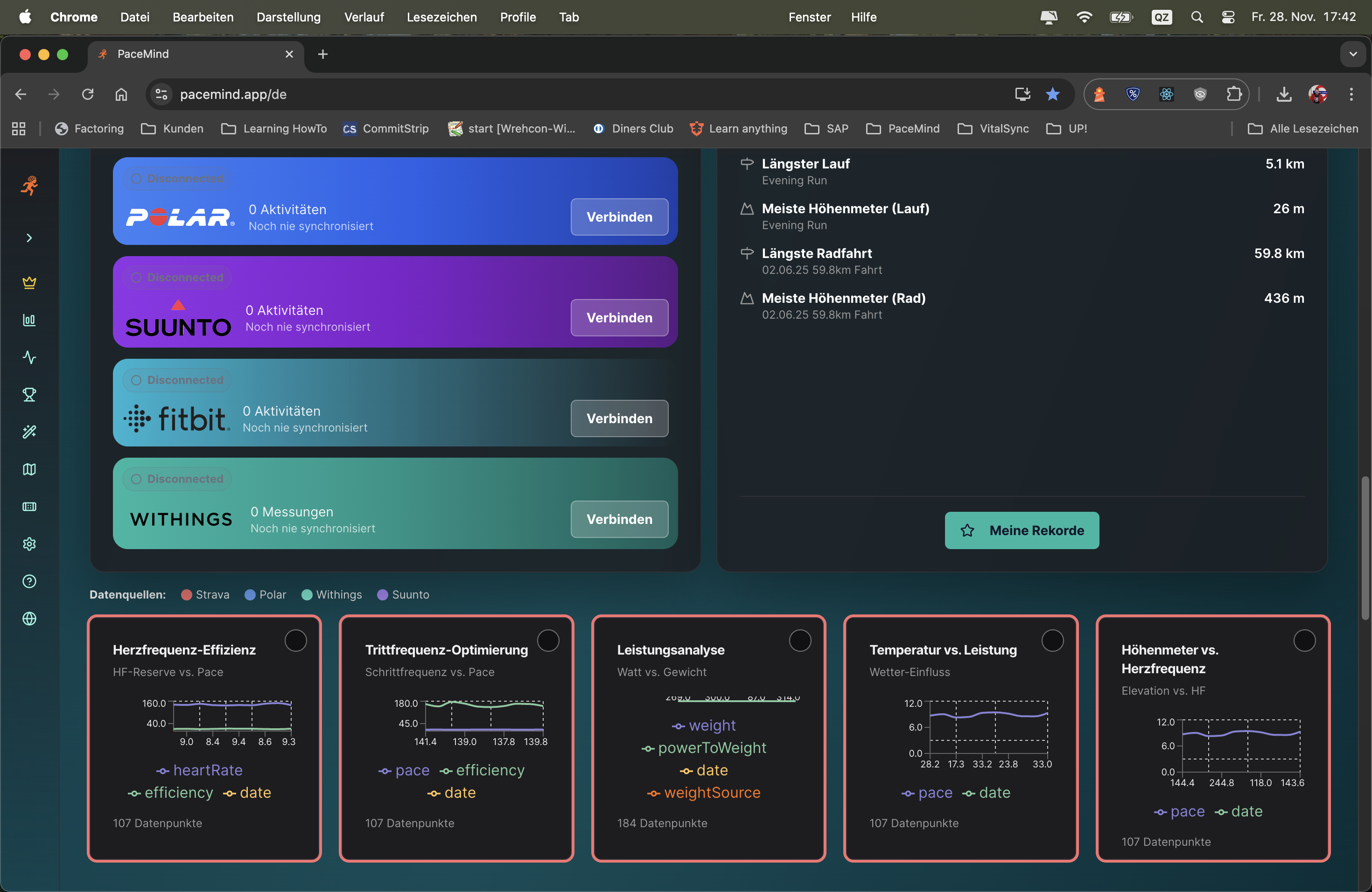
With Magic Chart you configure your individual visualizations:
Charts generated from your connected sources via "Analyze now" can be pinned to the dashboard:
Scenario 1 - Pace Analysis after Interval Run:
You completed an interval run and want to see how consistent your fast intervals were. With Magic Chart you select "Pace over Time" – immediately you see the peaks (intervals) and valleys (pauses). You recognize: The 4th interval was noticeably slower – possibly started too hard too early?
Scenario 2 - Heart Rate vs. Elevation on Trail Run:
After a hilly trail run, you're interested in how your body reacted to the climbs. You combine elevation + heart rate in Magic Chart. Result: On every steep climb your HR rises to 170+ bpm – but on flat sections it quickly recovers to 140 bpm. Good sign for your cardiovascular fitness!
Scenario 3 - Cadence Optimization:
You're working on your running technique and want to maintain a constant cadence of 180 spm. With the cadence chart you see immediately: In the first 3 km you're at 175 spm, then it rises to 182 spm. You now know: Conscious start with higher cadence helps you reach the goal.
Every athlete is different: Some primarily want to analyze their pace, others focus on heart rate zones, yet others on power metrics. With Magic Chart you get exactly the view that's relevant for YOUR training.
Different training types: An easy long run needs different charts than a tempo workout or hill intervals. With 2 clicks you adapt the visualization.
Splits calculated from your consolidated data are significantly more accurate than what you're used to. PaceMind uses all available GPS and sensor data from multiple sources to deliver the most precise split times – better than the display on your watch.
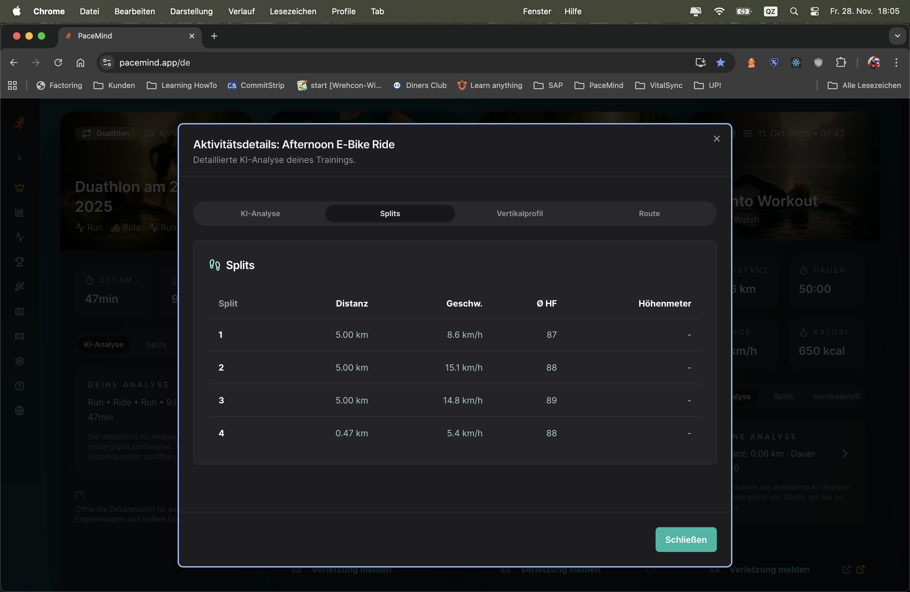
What your watch shows:
km 1: 5:05 | km 2: 5:12 | km 3: 4:58 | km 4: 5:28 | km 5: 5:15 | km 6: 5:42 | km 7: 5:18 | km 8: 5:10 | km 9: 5:05 | km 10: 4:55
What PaceMind shows after GPS smoothing and pause correction:
km 1: 5:08 (+12m↑) | km 2: 5:10 (+5m↑) | km 3: 5:00 (-3m↓) | km 4: 5:25 (+18m↑) | km 5: 5:12 (+2m↑) | km 6: 5:18 (90s pause corrected) | km 7: 5:15 (-8m↓) | km 8: 5:12 (+4m↑) | km 9: 5:06 (-2m↓) | km 10: 4:58 (-5m↓)
Insights through precise splits:
- km 6 showed 5:42 on the watch – but was a traffic light pause (90s), actual pace was 5:18
- km 1 seemed fast (5:05), but with +12m elevation it was actually harder than km 3
- km 4 was the slowest (5:25) – no wonder with +18m climb
- Negative split achieved: km 8-10 were all faster than km 1-3 (despite fatigue!)
GPS inaccuracy: GPS watches typically have 2-5% error tolerance. On a 10k run that's 200-500m deviation. PaceMind smooths GPS data over multiple data points and corrects outliers.
Auto-lap problems: Your watch triggers auto-lap at "1 km according to GPS" – but that can be at 980m or 1020m. PaceMind interpolates precisely to exactly 1000m.
Pause chaos: When you stand at a traffic light, the watch keeps running and distorts the split. PaceMind recognizes pauses and correctly removes them.
Multi-device fusion: If you wear watch + smartphone, PaceMind uses both GPS signals – this results in statistically more accurate position data than a single device.
The elevation profile shows you at a glance when and how steep it was during training. Perfect for trail runs, mountain tours or hilly cycling routes – see exactly where the climbs were and how your body reacted to them.
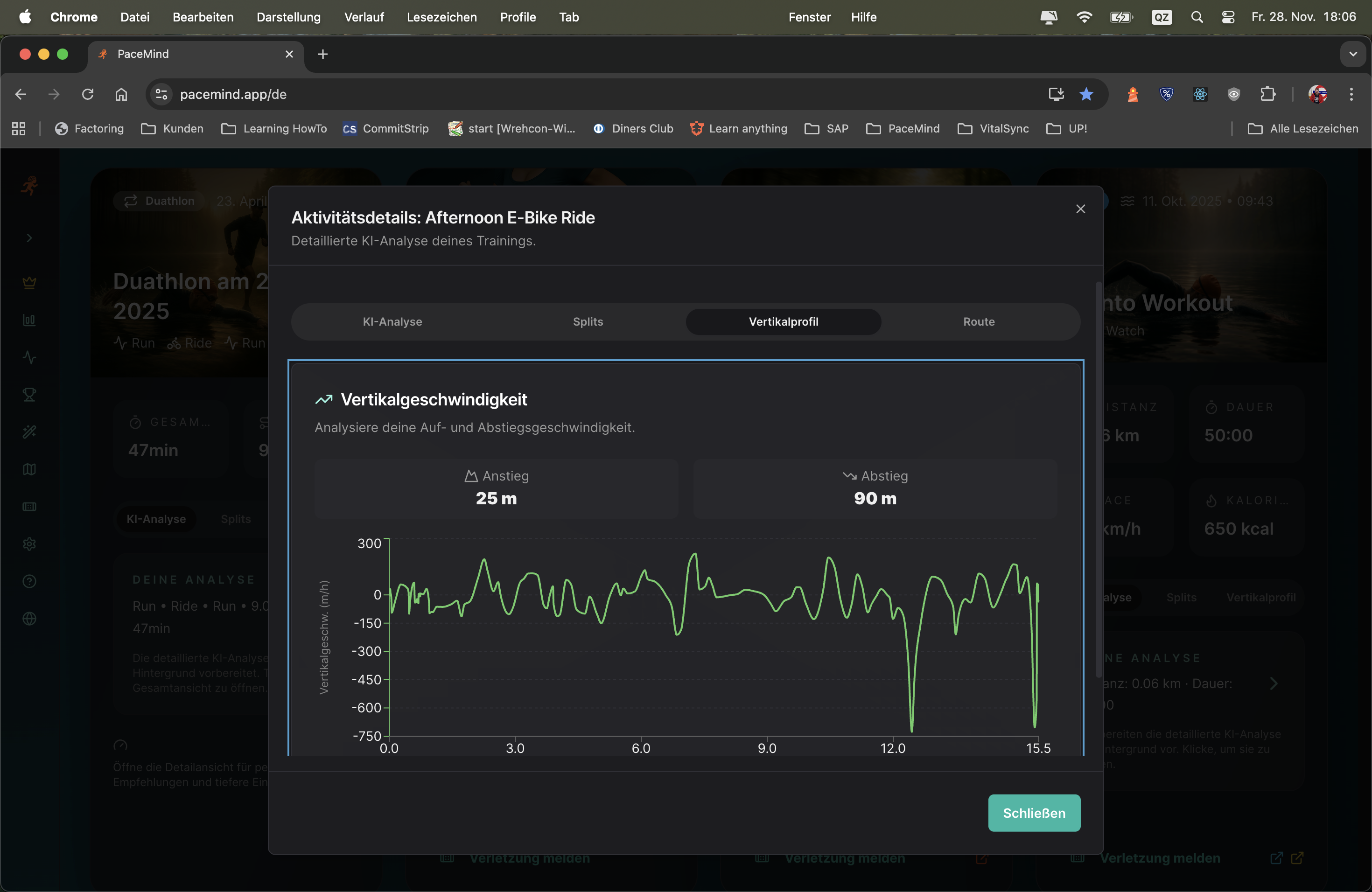
Your activity: 12 km trail run, 420m elevation gain, average pace 5:45 min/km
What the elevation profile shows:
Insights: Without elevation profile you would think km 3-5 were "bad" because of slow pace (6:30). But with 9% gradient and 180m elevation that's a strong performance! Your heart rate was constantly at 172 bpm there – you mastered the climb efficiently.
Pace without context is meaningless: A 10k run in 50 minutes (5:00 min/km) on flat terrain is completely different from 10k in 55 minutes (5:30 min/km) with 300m elevation gain. The elevation profile gives you this context.
Correctly assess training load: 200m elevation gain significantly increases training load – the elevation profile shows you whether your "easy" run was really easy or harder than expected.
Recognize strengths/weaknesses: Are you good uphill but lose too much time downhill? The elevation profile combined with pace data shows you.
Prepare race routes: When training for a competition, you can compare the elevation profile of the race route with your training – are you used to enough elevation?
Filter by activity type and time period:
Routing has several highlights: Not just seeing the route, but easily understanding speed through color coding. You instantly recognize where you were fast, where you slowed down – without having to analyze numbers.
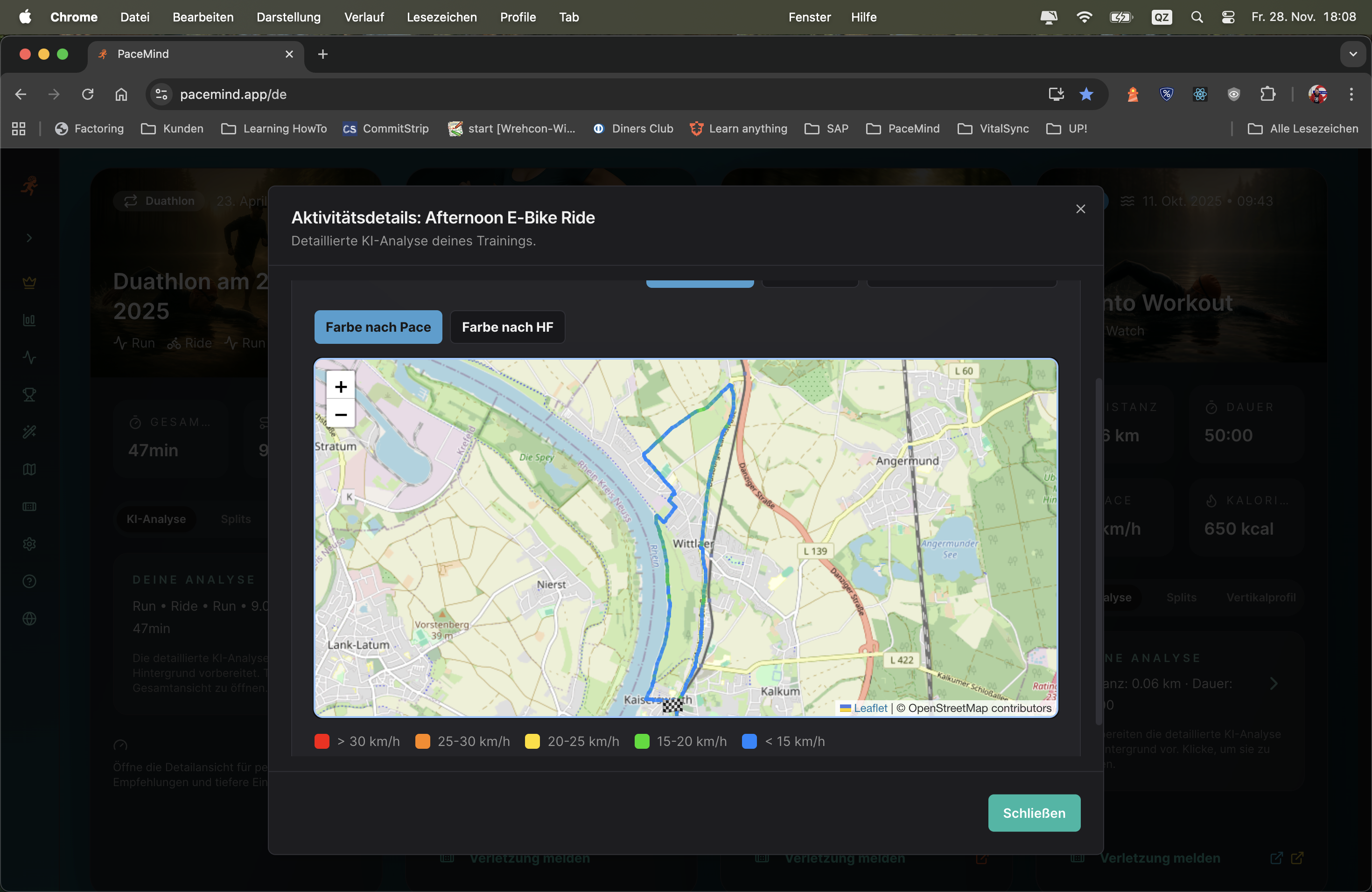
Your activity: 8 km interval run (4x 1km fast, 1km easy)
What the map shows:
Insights through color coding: You see immediately: The intervals get slower with each round (from green to light green to yellow-green). Also the recovery phases get slower (yellow → orange). That's a clear sign of fatigue – next time maybe start more conservatively!
Visual patterns immediately recognizable: Instead of reading 100 numbers in a table, you see at a glance: "Ah, in the middle part of the route I got slower (orange areas)."
Geographical context: You recognize: "Aha, at this intersection I always got slower – there's a traffic light!" or "This climb really slowed me down (red area)."
Trainingsplanning: For the next run you can specifically choose routes that allow more green areas (flat routes) or consciously include red areas (hills for training).
Race analysis: After a race you see immediately: "I started too fast (dark green first 3 km), then collapsed (orange/red last 5 km)."
Or also the heart rate: Recognize at a glance which part of your route challenged you the most. The map shows you not only where you were fast or slow, but also where your body really had to work hard – visualized through HR-based color coding.
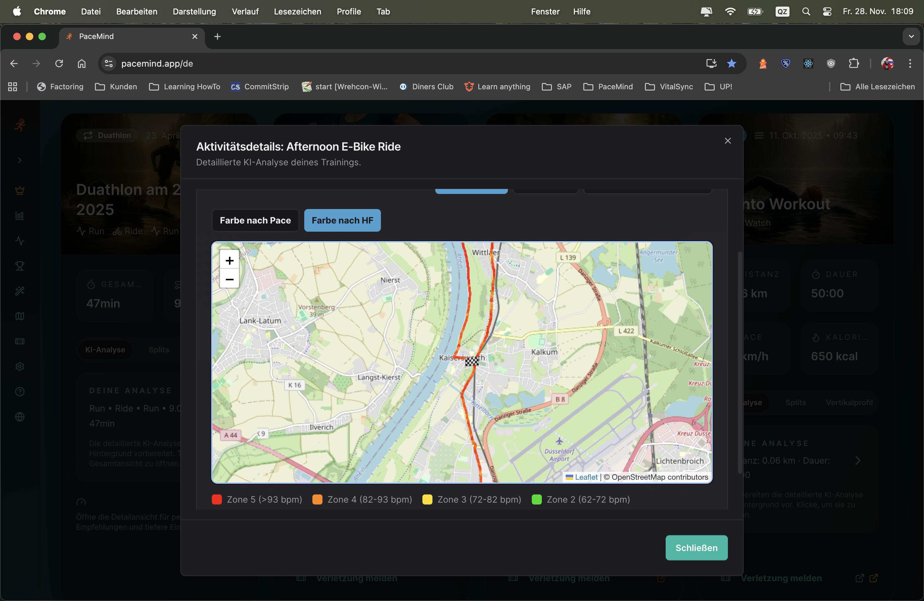
Your activity: 15 km long run with 250m elevation gain, goal: Zone 2 (easy)
What the pace map shows:
Mostly yellow (average pace 5:30 min/km), with some orange areas (slower, 6:00+ min/km) on the climbs.
What the HR map shows:
- First 3 km: Green (Zone 2, 135 bpm avg) – perfect!
- km 4-6: Orange/Red (Zone 4, 165 bpm) – climb! Although pace was slow (6:15 min/km), exertion was high
- km 7-10: Yellow (Zone 3, 152 bpm) – slightly too intense for "easy"
- km 11-13: Orange (Zone 4, 160 bpm) – second climb, high exertion again
- km 14-15: Green (Zone 2, 140 bpm) – cool-down
Insights: The pace map says "ran okay", but the HR map shows: You were too often in Zone 3/4 for an "easy" long run. The climbs challenged you more than you thought (high HR despite slow pace). Next time: Even slower on the hills to stay in Zone 2!
Route planning: After the run you see: "Aha, this one hill (red area) really challenged me. If I train there more often, my hill fitness will improve."
Pace control: For your next run on this route you know: "At km 5 comes the climb (was orange/red) – start consciously slower there to avoid overpacing."
Race strategy: If the race route has similar hills, you can be mentally prepared: "At km 8 comes the hard section – don't be discouraged, that's normal."
Gezondheid monitoring: If your HR map for the same route is suddenly much redder than usual (higher exertion at same pace), that could indicate overtraining, illness or poor sleep.
Of course you can also play your route dynamically: From slow motion to turbo, any speed is adjustable and you can zoom the map as you like. At every second you're shown distance, pace, heart rate, elevation and elapsed time – nothing remains hidden.
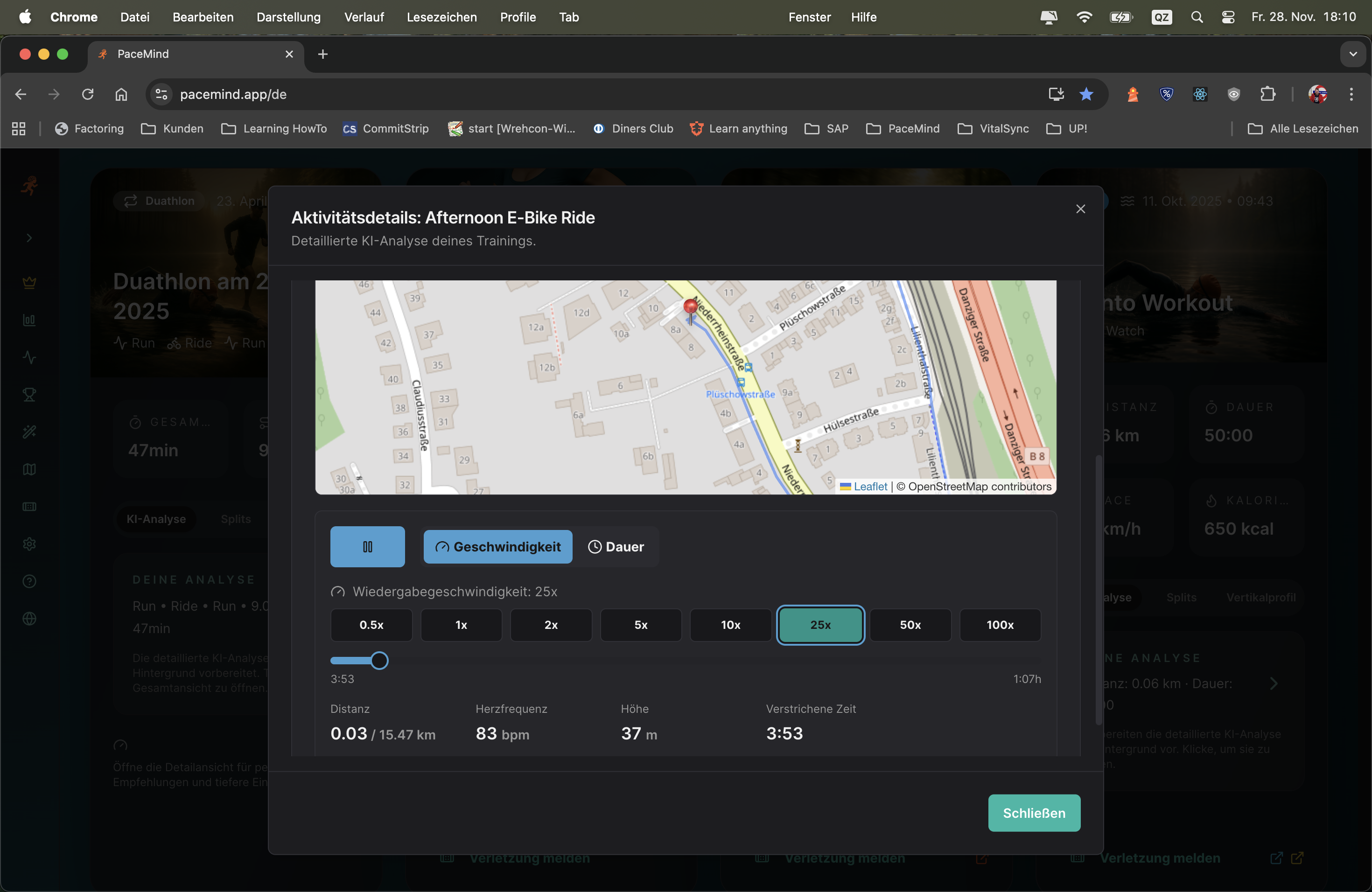
Your activity: Marathon in 3:45h – you want to understand why you slowed down in the second half
How you use Route Replay:
Time + location + metrics combined: Static data tells you "at km 27 your pace was 5:50". Route Replay shows you: "At km 27, at this intersection, you had 5:50 pace, 168 bpm HR, and it was slightly uphill. You were tired."
Mental preparation: If you want to run the same route again (e.g., annual repetition of a race), you can mentally prepare: "At km 15 comes the bridge – that's where it gets hard."
Coaching tool: Trainers can go through your route with you and see exactly where problems occurred – not just "km 8 was slow", but "at this spot at km 8, when you took the turn".
Refresh memories: Weeks after training you can go through again and remember: "Oh yeah, right here was the traffic light where I had to wait."
The highlight is 3D mapping with dynamic camera flight (also manually controllable): Experience your workout again as it really was – you'll find buildings, landmarks, hills, simply everything that can be calculated in reasonable time.
Immersive 3D experience: Not just a flat map, but a photorealistic 3D reconstruction of your route with real terrain, buildings and satellite view. Fly over your route like with a drone.
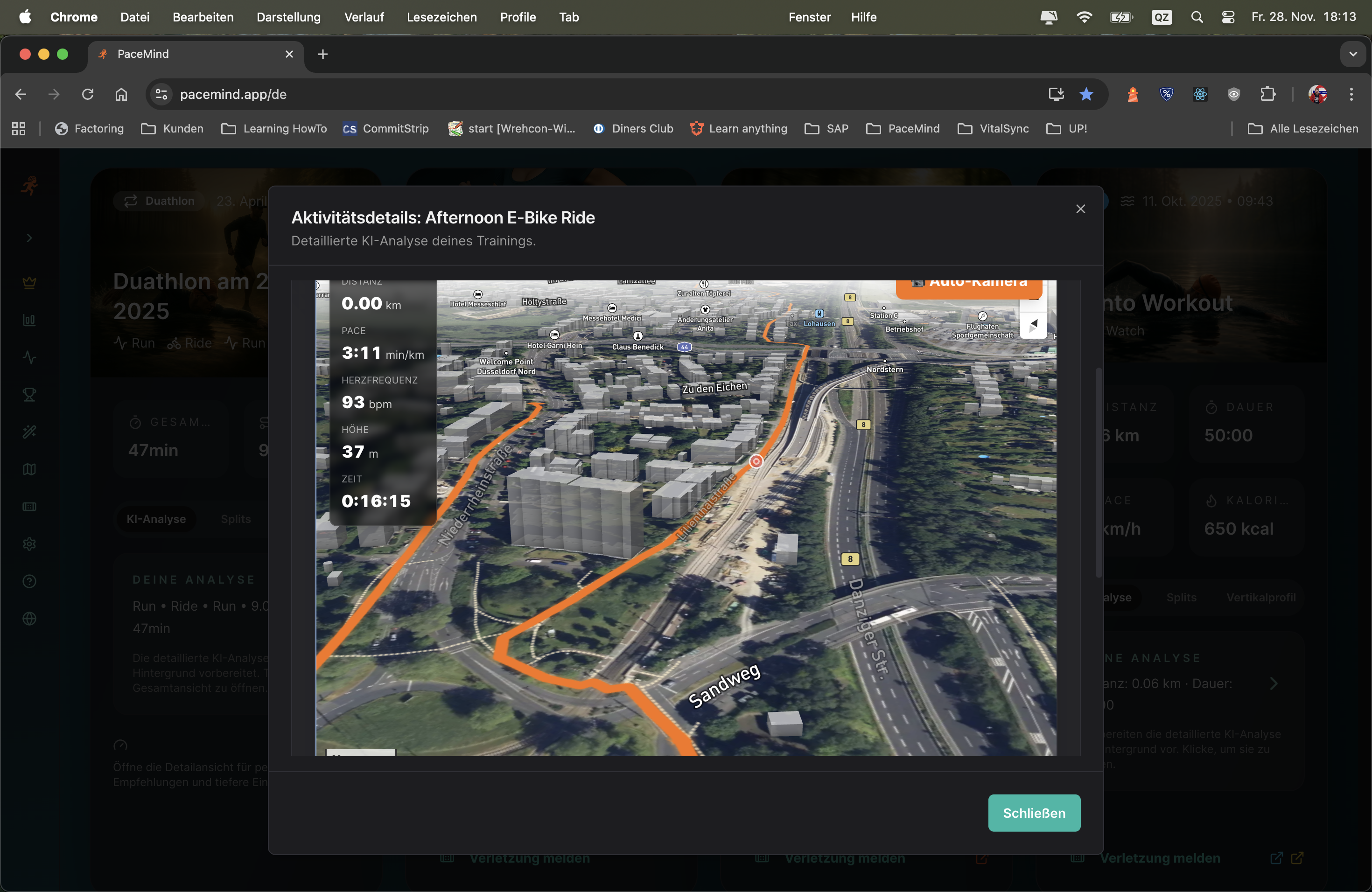
Your activity: 15 km mountain run with 800m elevation gain
What you see in 3D:
Metrics during the flight:
- At km 3: Pace 6:45 min/km (slow!), HR 175 bpm (Zone 5), elevation 580m – but you see: It goes almost vertically uphill (3D shows 12% gradient)
- At km 8: Pace 4:20 min/km (very fast!), HR 145 bpm (Zone 2), elevation 320m – you see: Steep descent, therefore fast despite low HR
City run analysis: Run through a city – recognize buildings, bridges, parks. "Aha, here I passed city hall" or "That's the bridge where I had to wait."
Race preparation: Upload the GPX file of the Berlin Marathon → Fly the route in 3D → Recognize critical points: "At km 30 comes an underpass, then it goes slightly uphill" → Mentally prepared for race day!
Vacation memory: Did a mountain run on vacation? Months later you can fly the route again in 3D and remember: "Right, that was this beautiful lake at km 7!"
Plan training routes: Look at a potential new route in 3D (upload GPX) → See if there's shade (tall buildings/trees), if it's hilly, if it goes through parks → Decide if the route suits you
Social media content: Take a video/screenshot of the 3D view → Share on Instagram/Strava → Much cooler than normal map screenshots!
High computing power: 3D rendering with real terrain, building representation and satellite views is technically very complex and cost-intensive
Infrastructure costs: Photorealistic 3D map representation causes significant API and server costs – premium users enable this technology
Unique feature: Only very few platforms offer 3D route replay – this is a real unique selling point
Value proposition: For ambitious athletes who want to professionally analyze their training or experience epic routes, 3D is priceless
Training heatmap: At a glance recognize your running and cycling routes and with the heat overlay immediately see where you're most often active. All your GPS data is aggregated and visualized as a heatmap – the more intense the color, the more frequently you were there.

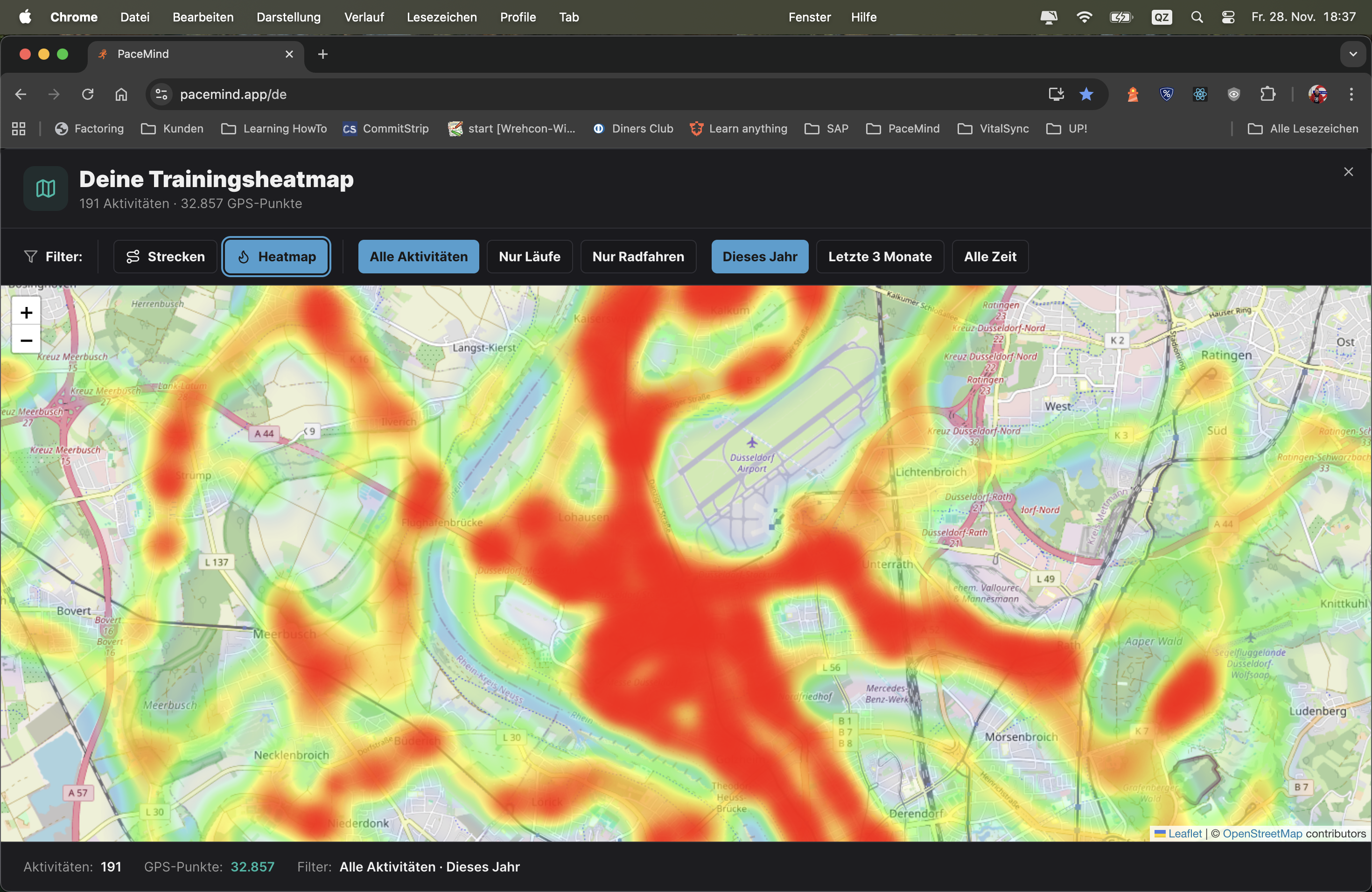
Situation: You've been running in your city for 2 years – but want to know which routes you run most frequently
Heatmap shows:
Insights: You recognize: 80% of your runs are the same 5km loop! Time for variety? → Consciously plan new routes for more variety.
Recognize route monotony: If 90% of your heatmap is red on a single route, you might be running too one-dimensionally → Mentally boring, physically not very adaptive.
Discover new areas: Look at the map – which areas are completely empty (no heatmap activity)? → Consciously plan runs/rides to these areas for variety.
Seasonal patterns: Filter "Last 6 Months" → Do you only see city routes? → In summer you were more in forest/nature → Recognize your preferences.
Vacation memory: Heatmap also shows your training on vacation – see the beaches, mountains, cities where you ran/cycled.
Route planning: You want to plan a new 10km route? → Look at the heatmap → Combine several known segments into a new route.
Race preparation: If you're training for a race taking place in your city → Check with the heatmap if you've already trained the race route often (red/orange) → Advantage: You know the route!
Moving to new city: After 6 months → Look at the heatmap → Do you see which areas you already know well? Where are there still white spots? → Plan exploration runs.
Year in review: Filter "This Year" → See all routes of the year at a glance → Share screenshot on social media: "My 2024 running routes – 1,847 km on these tracks!"
Running vs. Cycling: Compare: Filter "Run" → You see your running routes (mostly local). Filter "Ride" → You see your cycling routes (much more spread out). → Recognize: Cycling you explore much more area!
Training camp memory: You were at training camp in Spain? → Heatmap shows red cluster in Spain → Years later: "Oh yeah, I was training there – nice memory!"
Find route favorites: Which route do you really run most? → The dark red route in the heatmap is your favorite (frequency = preference).
More features will be added...
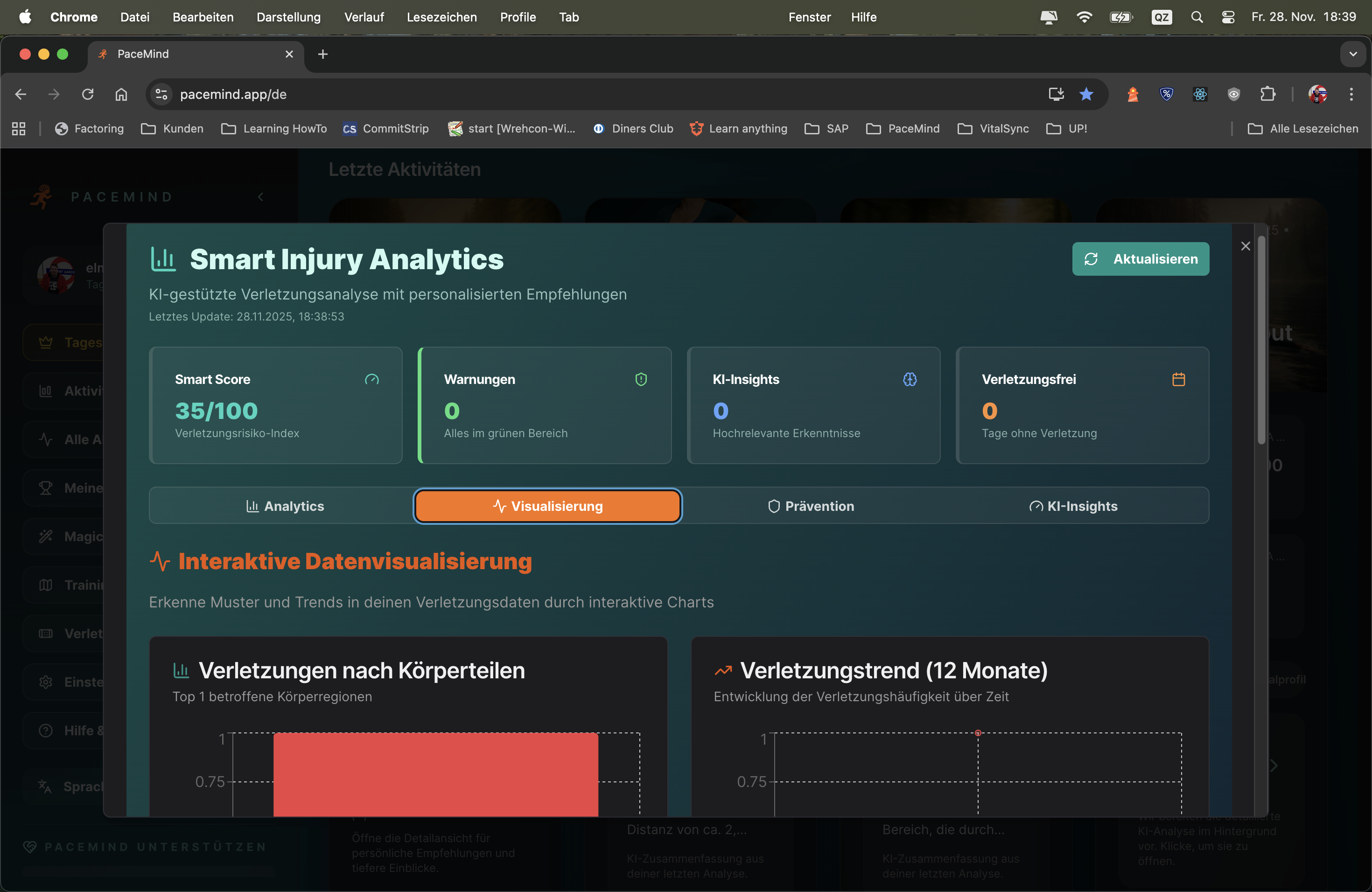
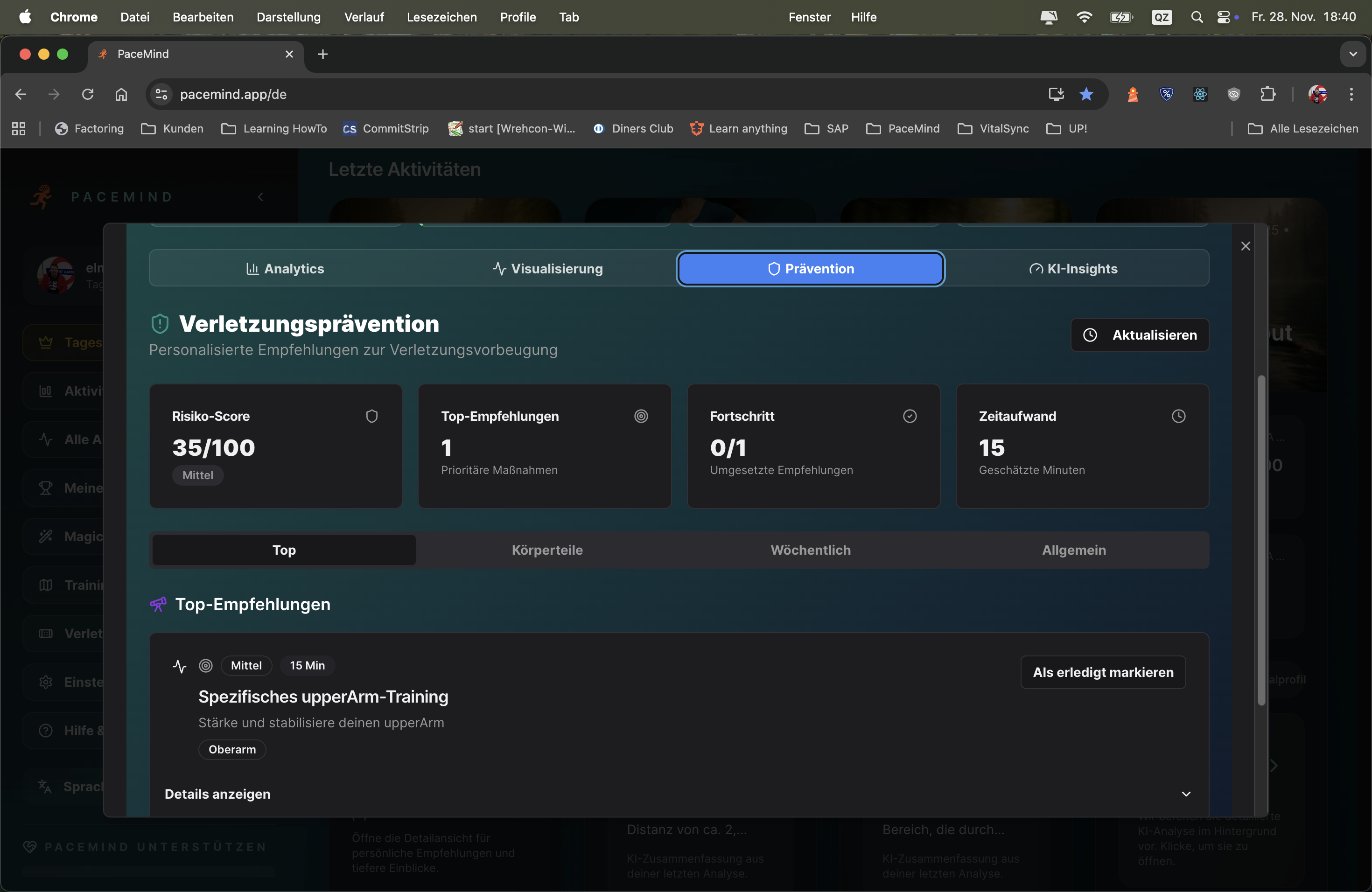
Document injuries easily and quickly:
Document injuries and pain related to your training with a mouse click: The system recognizes patterns, warns of injury probabilities, reliably detects overtraining and overload, offers prevention measures tailored to your pain and injury patterns.
Never be surprised by an injury again, but take countermeasures before it happens – that's the goal of SIP. Unique!
Starting situation: You've been running for 6 months and occasionally have knee pain
What you document:
What SIP recognizes:
SIP's prevention recommendations:
Result: You follow the recommendations → After 3 weeks: Knee pain at 0/10 → You run again, but more carefully (max 12km, flat routes) → No new complaints!
Proactive instead of reactive: Most athletes only react to injuries when they're already there. SIP warns BEFOREHAND – you see the pattern before it's too late.
Data-driven: Not gut feeling, but hard facts: "You had knee pain 5x after long runs" → That's evidence, not coincidence.
Personalized: Every athlete is different. Your knees might be vulnerable, while others have Achilles tendon problems. SIP adapts to YOUR patterns.
Overtraining detection: Many injuries in a short time? → SIP recognizes systemic overload, not just individual aches.
Activity correlation: "Your shoulder pain only occurs when swimming, never when running" → Clarity about causes.
Long-term tracking: You see your injury history over months/years → Recognize seasonal patterns (e.g., "More Achilles tendon problems in winter due to cold muscles").
Marathon preparation: You increase your volume for a marathon → SIP warns: "Your weekly volume increased 60% in 4 weeks – high injury risk!" → You reduce the pace of increase → Injury avoided!
Comeback after break: You had 3 months break (injury/vacation) → When restarting you document every small complaint → SIP warns early if you're doing too much too fast.
Equipment change: You buy new running shoes → After 3 runs: Achilles tendon pain → SIP shows: "Since shoe change 3x Achilles tendon!" → You switch back to old shoes → Problem solved.
Trainingsplanning: SIP shows: "You had no injuries in the last 6 months as long as you stay <30km/week" → You now know your safe training zone.
Race decision: Race in 2 weeks, but you have knee pain 5/10 → SIP warns: "At 5/10 pain, injury risk increases 200% if you race" → You cancel, heal up, race healthy next month.
Every record links directly to the workout for detailed analysis:
Never miss a record again: PaceMind evaluates device-independently and naturally also provides a link to the record workout. Whether you train with Polar, Garmin, Suunto or Strava – all personal bests are automatically recognized and clearly displayed.
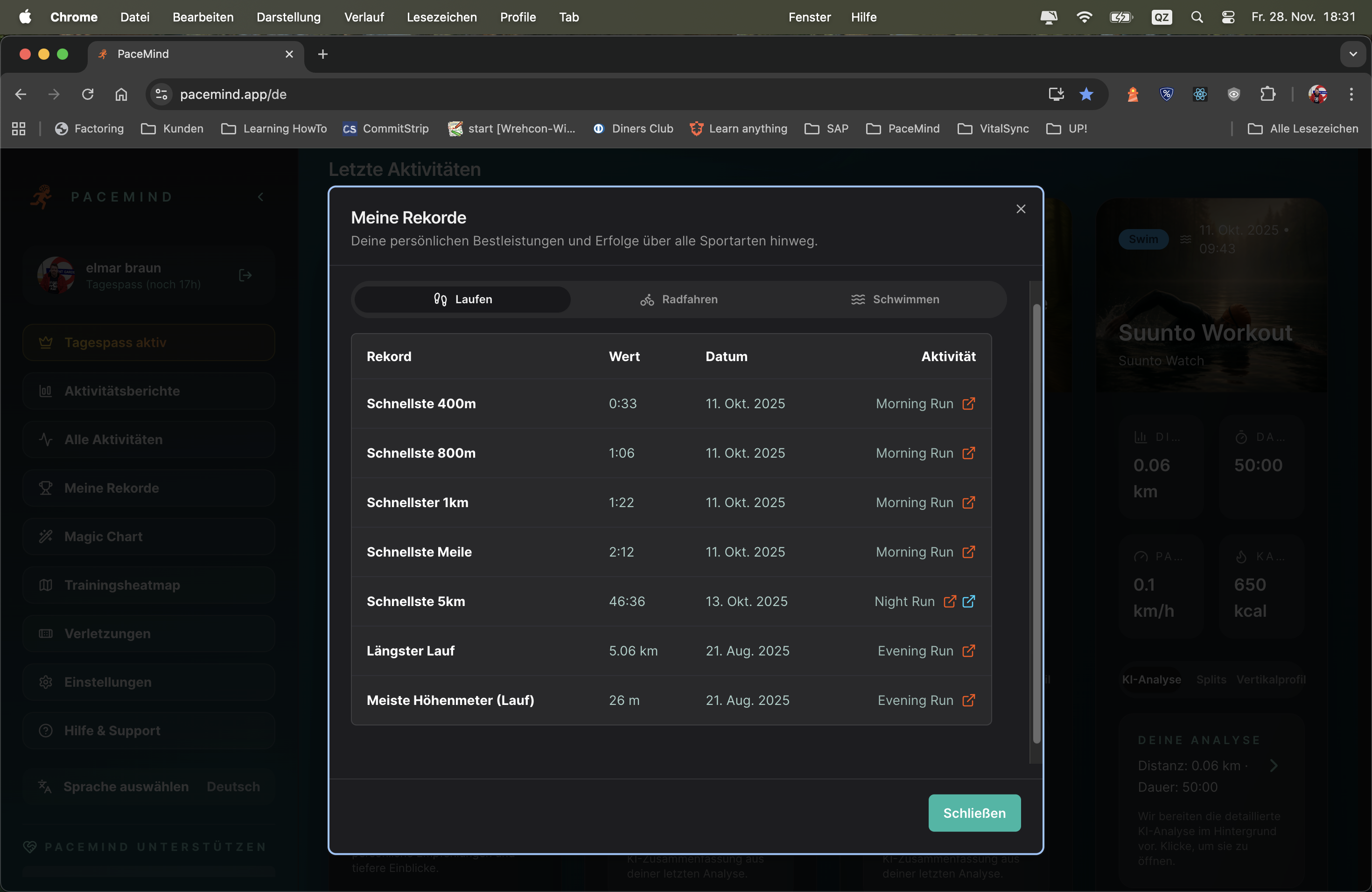

Situation: You run a marathon in 3:45h. You think: "My 10km PR is 45 minutes."
What PaceMind discovers:
Insight: Without PaceMind you would never have discovered this PR – you didn't even know you ran a personal best over 10km in your marathon!
Motivation through achievements: When you see: "Longest run: 32km (Oct 15, 2024)" you feel proud – you accomplished this performance!
Make progress measurable: Your 5km PR dropped from 23:45 to 22:10 over 6 months? That's hard evidence of improvement!
Goal setting: "My 10km PR is 45 min – next goal: Sub-43!" – Records give you clear goals.
Race preparation: When training for a marathon, you see: "My longest run so far: 28km" → You know you need at least one 32km+ long run.
Discover hidden PRs: Split-based analysis finds PRs you would never have recognized yourself – in long runs, tempo workouts, races over other distances.
Year in review: End of year → Openen record overview → See all PRs of the year at a glance → Share on social media: "2024: 5km PR 22:10, 10km PR 45:30, marathon PR 3:45!"
Plan training: You want to work on your 5km PR? → Click on "5km PR: 22:10" → Openens the activity → Analyze: How did you run? Evenly? Started too fast? → Learn for next time
Race motivation: Before a race → Look at your PRs → "My 10km PR is 45 min – today I'll crack 43!" → Mentally prepared
Long-term progression: Compare PRs from 2023 vs. 2024 → Did you get faster? Or are you stagnating? → Recognize trends
The multisport analysis is unique: There are only very few and mostly high-priced watches that can record duathlon, triathlon or even free multisport workouts. PaceMind automatically recognizes such units in your data and displays them with thorough analysis clearly.
Automatic recognition: You don't need to mark anything manually – PaceMind analyzes your activities and recognizes when multiple disciplines (swimming, cycling, running) are temporally connected. Even if your watch doesn't have multisport tracking, you get the analysis.
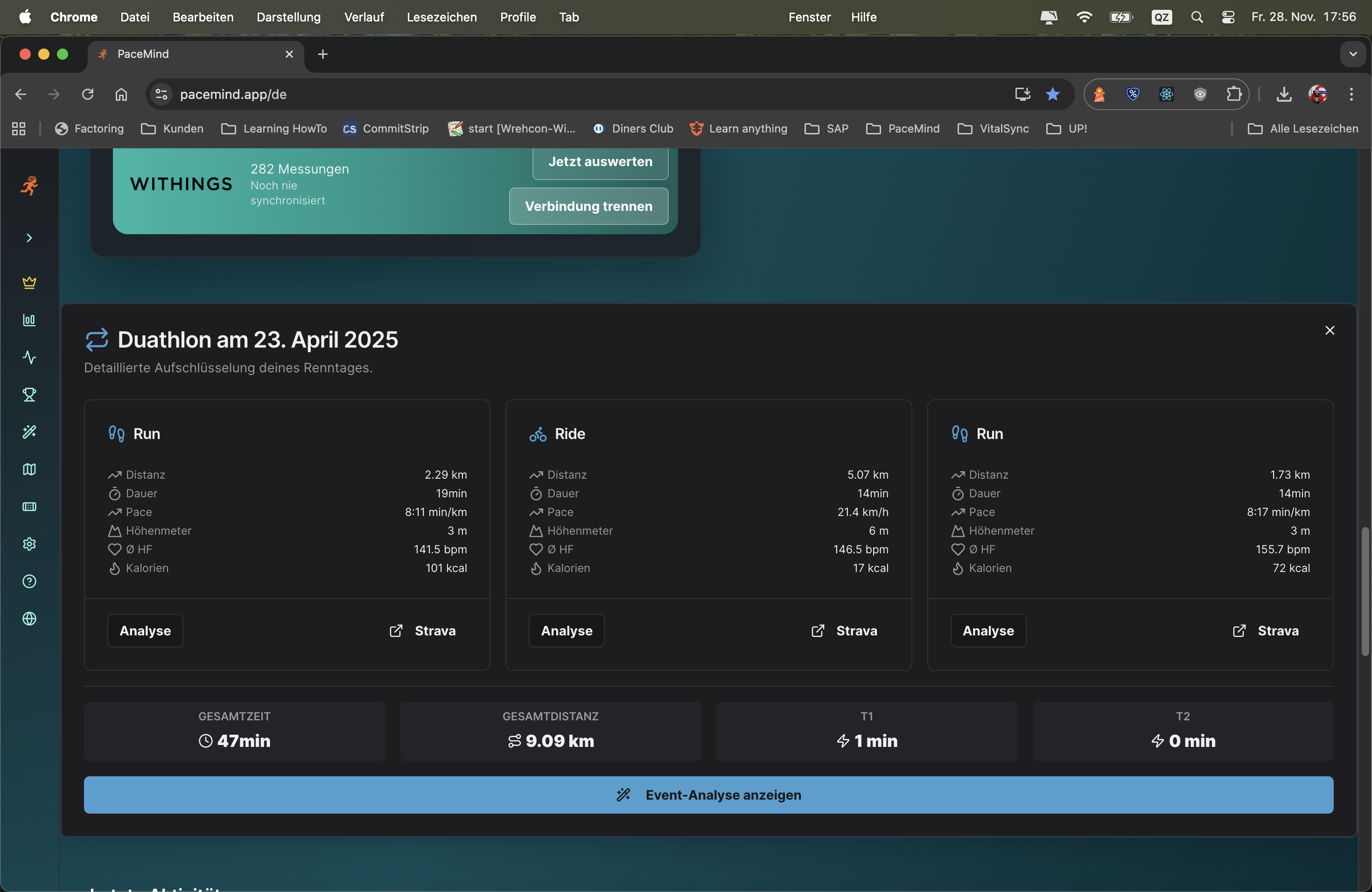
Scenario 1 - Triathlon without multisport watch:
You have a cheap GPS watch without multisport mode. At your sprint triathlon you manually start and stop the watch for each discipline:
- 9:00 AM: Swim recorded (750m, 15 min)
- 9:18 AM: Bike recorded (20km, 38 min)
- 10:00 AM: Run recorded (5km, 24 min)
PaceMind automatically recognizes: This is a triathlon! You get a complete event analysis with total time (1:17h incl. transitions), segment breakdown and AI insights – even though your watch can't do multisport.
Scenario 2 - Brick training analysis:
You do brick training (bike → run directly one after another, typical triathlon training):
- 40 km cycling (1:30h, 26 km/h avg)
- 10 km running (52 min, 5:12 min/km)
PaceMind recognizes the pairing and analyzes: "Your run pace was 25 sec/km slower than isolated runs – that shows good brick specificity. Your HR in the run was 8 bpm higher despite slower pace – normal fatigue after the bike."
Scenario 3 - Race comparison:
You completed two Olympic triathlons (1.5km swim / 40km bike / 10km run). PaceMind automatically compares:
- Event 1: Swim 32 min, bike 1:15h, run 48 min = total 2:35h
- Event 2: Swim 30 min, bike 1:18h, run 45 min = total 2:33h
AI analysis: "You were 2 min faster in the swim, but lost 3 min on the bike – probably wind or hilly course? But you caught up strongly in the run (-3 min). Overall 2 min faster – good progression!"
Bypass high hardware costs: Multisport-capable watches often cost 500-800€ (e.g., Garmin Forerunner 955/965, Suunto 9 Peak Pro). PaceMind gives you the same analysis depth – even with a 150€ GPS watch.
Cross-platform: Even if you use different devices for different disciplines (e.g., Garmin for bike, Polar for run), PaceMind recognizes the event.
AI-powered insights: Very few platforms offer in-depth multisport analyses. Strava shows you the segments, but no insights. PaceMind analyzes pacing, fatigue, transitions and gives concrete improvement suggestions.
Automatic & intelligent: No manual work – PaceMind handles recognition and consolidation fully automatically.
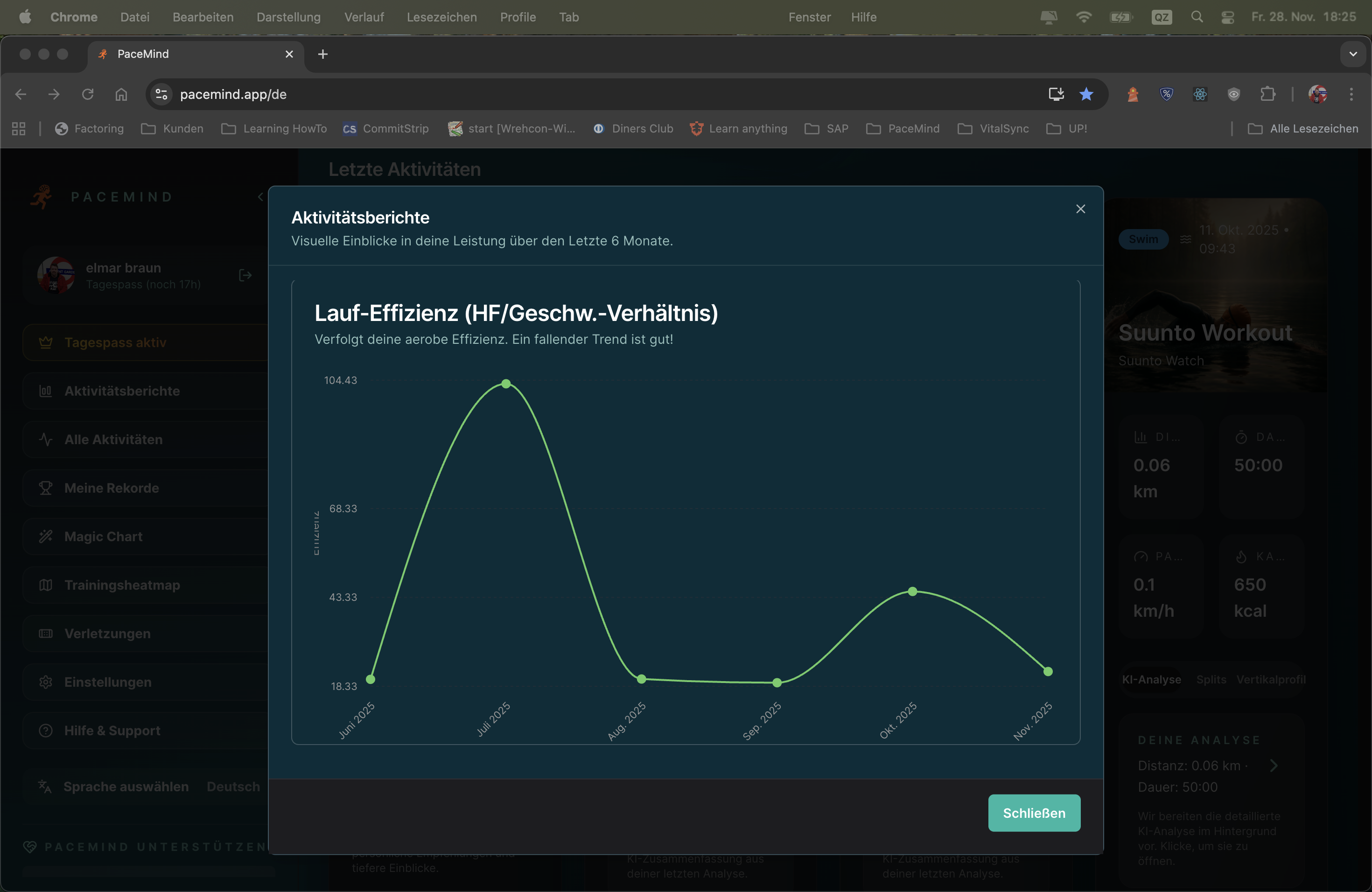
Detailed analyses show you how your performance develops:
Activity reports that move you forward: Global with time period comparison, but also in detail. See at a glance which distances you typically run, how your pace changes or your running efficiency improves – the key to success is long-term analysis of your data.
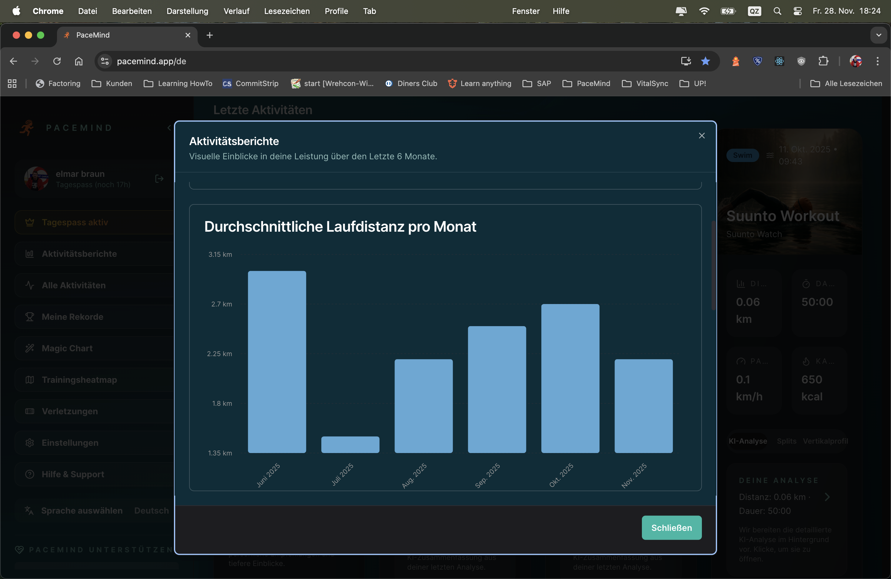
Your goal: Marathon in 16 weeks – you want to see if your preparation is on track
Report 1 - Maandelijks statistics (last 4 months):
Insights: Volume increases continuously (+67% from August to November), pace improves (-12 sec/km) → Great progression! You're on track.
Report 2 - Elevation gain:
Insights: You're training more elevation – good for strength and endurance, even if the marathon is flat.
Report 3 - Running efficiency:
Insights: You run 12 sec/km faster with 3 bpm lower heart rate → Your aerobic fitness has improved massively! That's proof of successful preparation.
Trends instead of snapshots: A single run tells you little. But when you see your pace continuously decreasing (getting faster) over 3 months, that's hard evidence of progress.
Early warning system: If your monthly volume suddenly drops (e.g., from 180 km to 100 km), that can be a sign of overtraining, illness or lack of motivation. You recognize it early and can counter.
Planning & periodization: You see: "In winter I always run less (shorter days, bad weather)." → Next year you can specifically counter with indoor training or better motivation.
Motivation through numbers: When you see: "This year I ran 1,847 km (last year only 1,200 km)", that's a huge motivation boost. Numbers don't lie – you improved!
Efficiency tracking: Running efficiency (same pace at lower HR) is the best indicator of aerobic fitness. Reports show you in black and white: "You got fitter."
Year in review: End of December → Create yearly statistics report → See what you accomplished → Share on social media: "2024: 1,847 km, 142 runs, 89 hours!"
Trainingsplanning: Before new training phase → Analyze last 6 months → Recognize weaknesses (e.g., too little elevation, too much Zone 3) → Plan specifically against it
Race preparation: 8 weeks before race → Compare with preparation for last race → Are you further than back then? Or behind?
Recognize plateau: Pace stagnating for 3 months? → Report shows it clearly → Time for new training stimulus (intervals, tempo runs, more volume)
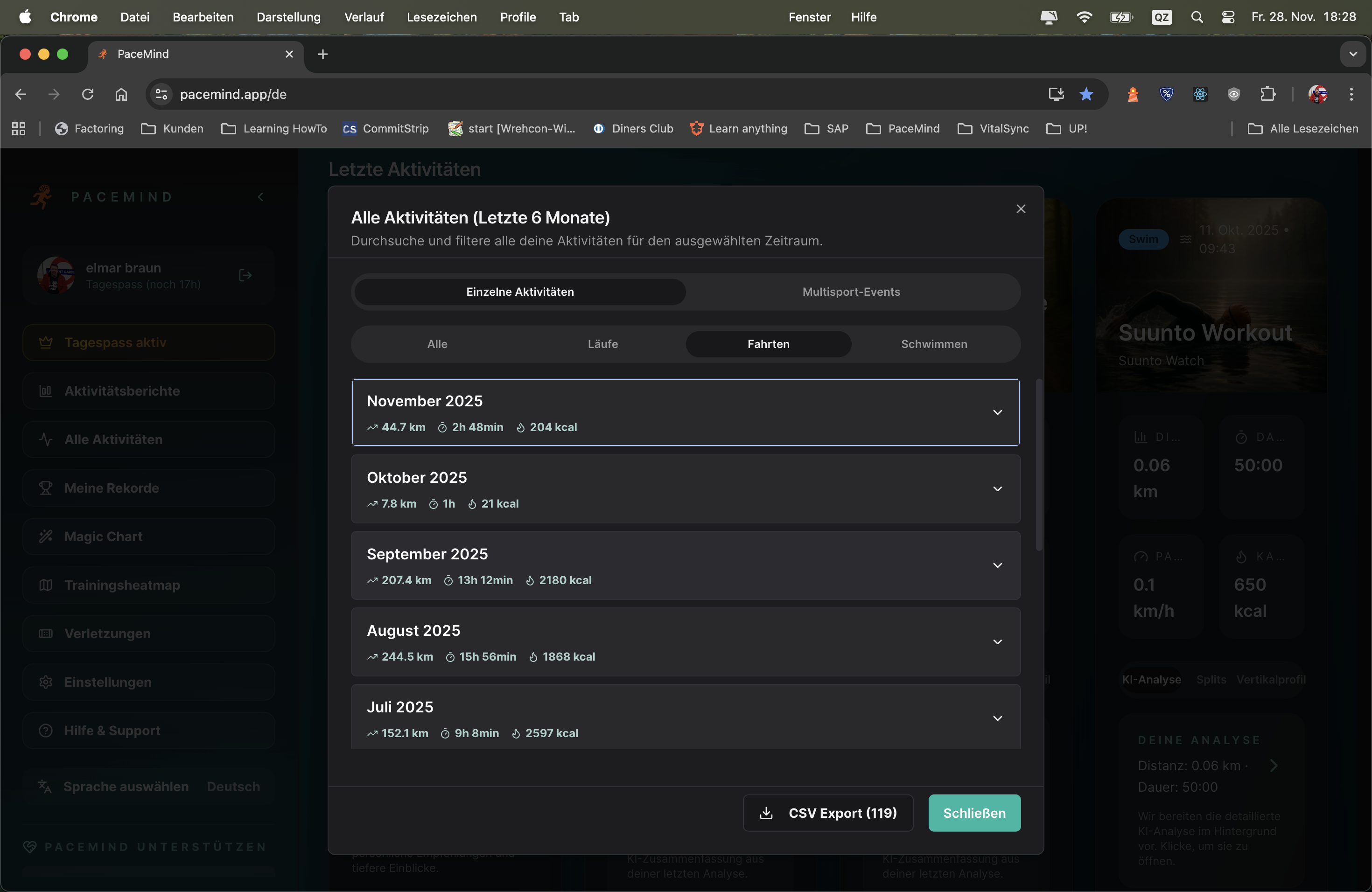
PaceMind keeps track of your training: All training sessions you've done – measured with any device – in one place, directly analyzable. And because the core sports running, cycling and swimming are grouped separately, you see at a glance for example how many kilometers you cycled last month, what calories you burned and how long you were out.
Expand the month and you see every single workout – analyzable in detail.
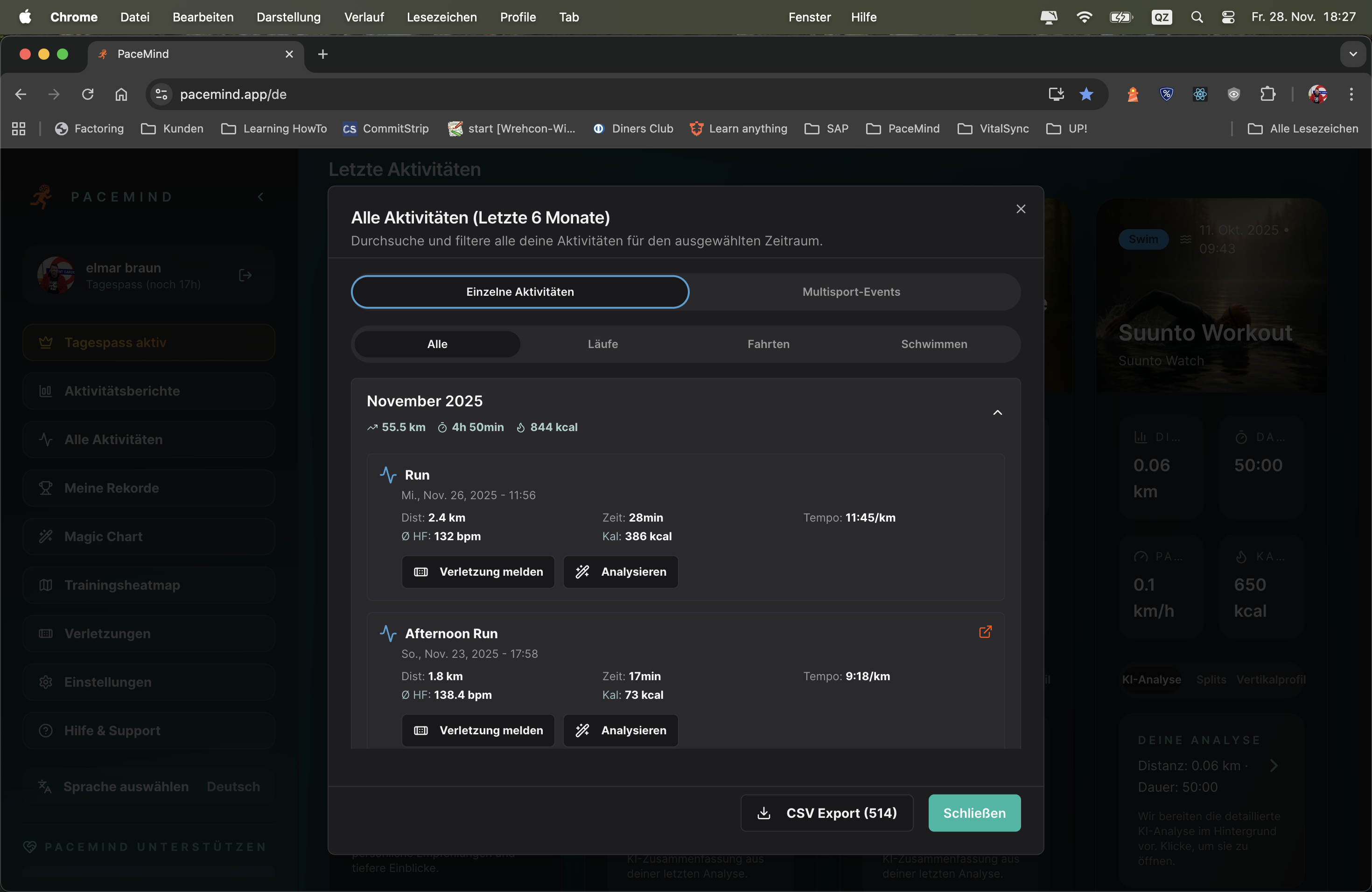
Expand a month and see every workout in detail:
Situation: You're training for a triathlon and want to see if your training is balanced
Running (October):
Cycling (October):
Swimming (October):
Insights: You run the most (18x), swim the least (8x). For a triathlon you should include more swimming – the overview shows it immediately!
Maandelijks review: "How much did I run in October?" → Openen running overview → See immediately: 185 km in 18 runs. Done.
Find workout: "I'm looking for my long run from October 15" → Expand October in running category → Scroll to Oct 15 → There it is!
Device change transparent: You ran in October partly with Polar, partly with Garmin? Doesn't matter – both appear in running overview, deduplicated and consolidated.
Volume check: "Am I cycling enough this month for my goal (300 km)?" → Openen cycling overview for current month → See: 220 km so far → Still need 80 km!
Race preparation: "In the last 8 weeks before my last marathon I ran 450 km – can I achieve that again this time?" → Expand last 2 months → Add up → Compare.
Reduce cognitive load: Instead of scrolling through 100 mixed activities (running, cycling, swimming mixed), you only see what interests you.
Faster overview: "How much did I run this month?" – In a mixed list you need to add up all runs. Here: One glance, done.
Trainingsplanning: You see immediately: "I only swam 3x this month – too little!" → Consciously plan 2 swim sessions next week.
Multi-device transparency: You switch between devices/platforms? In the sport-specific view you see everything together – no gaps, no duplicates.
Jouw data behoort JOU toe! Exporteer elke activiteit in 5 professionele formaten:
Geen vendor lock-in, geen data-gevangenschap – je hebt volledige controle over je trainingsdata.
Datasoevereiniteit: Jouw trainingsdata behoort JOU toe, niet het platform. Je kunt het op elk moment meenemen.
Backup: Exporteer regelmatig je data als PDF-rapporten of CSV – als PaceMind ooit offline is of je wisselt, heb je alles veiliggesteld.
Externe analyses: CSV-export voor Excel/Sheets met je eigen draaitabellen, Python/R-analyses – volledige flexibiliteit.
Platform-wissel: GPX/TCX/FIT-export maakt naadloze import mogelijk in Garmin Connect, Strava, TrainingPeaks en alle andere platforms.
Langetermijnarchivering: PDF-rapporten zijn universeel leesbaar, zelfs over 10 jaar – je trainingsdata voor altijd veiliggesteld.
Jaararchief: Einde jaar → Exporteer top 10 runs als PDF-rapporten → Bewaar op harde schijf/cloud → Professionele trainingsdocumentatie.
Social media/blog: Deel je marathon → Exporteer als PDF-rapport → Post op Instagram/Facebook met professionele statistieken.
Delen met trainer/coach: Jouw trainer gebruikt TrainingPeaks? → Exporteer als TCX → Importeer in zijn tool → Volledige trainingsanalyse mogelijk.
Platform-migratie: Wil je terug naar Garmin Connect? → Exporteer alle activiteiten als FIT → Importeer in Garmin → Naadloze overstap zonder dataverlies.
Custom analytics: Data-nerd? → CSV-export → Importeer in Python/R/Excel → Creëer je eigen analyses, visualisaties, machine learning-modellen.
PaceMind understands you – in your language!
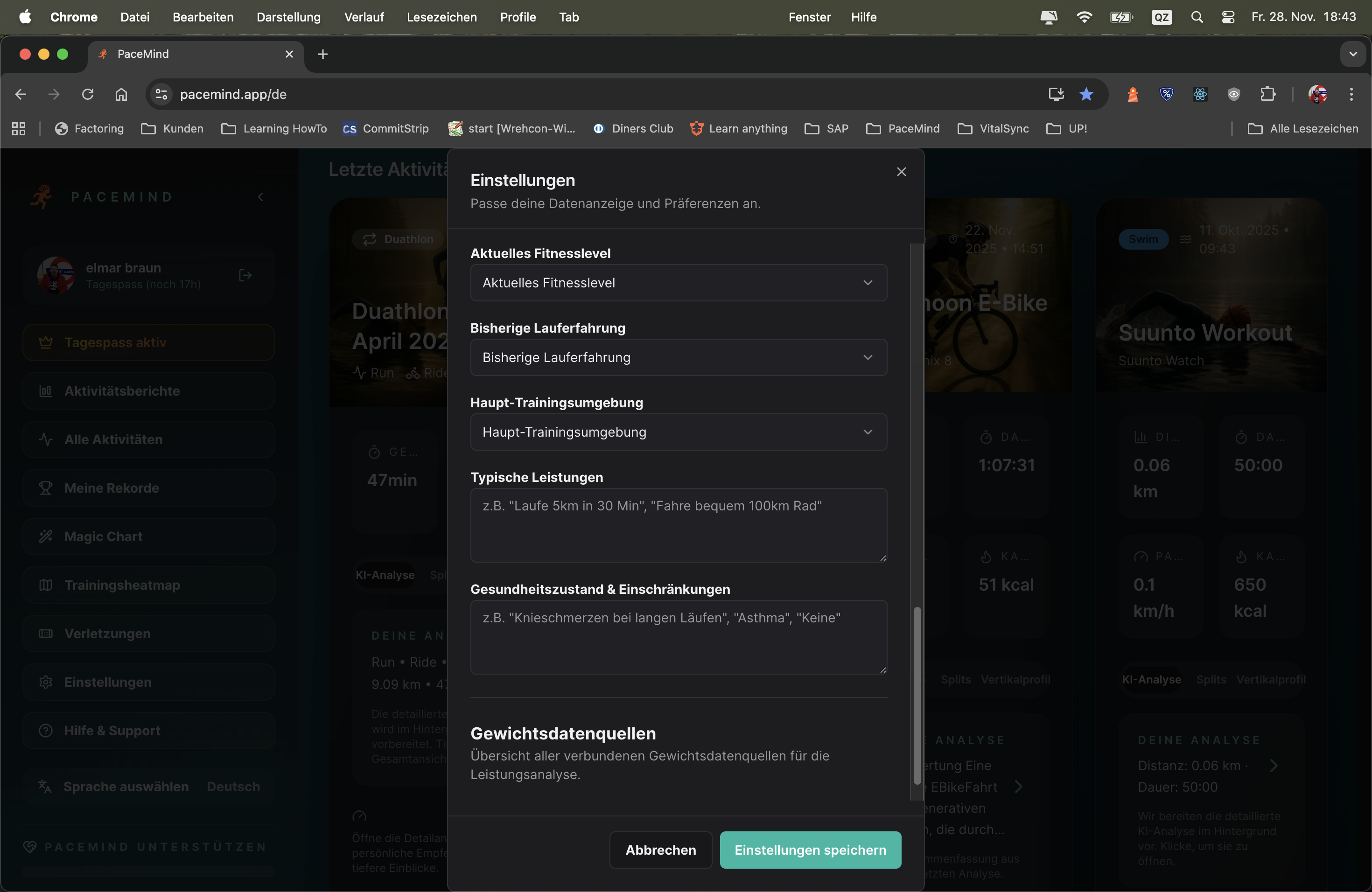
Because PaceMind is smart, there's no rigid framework. In your settings you briefly tell about yourself: How you prefer to train, what your goals are and what PaceMind should pay attention to – in natural language! No framework or checkbox chaos, write what you need and want – PaceMind understands you.
And speaking of understanding: PaceMind speaks 6 languages – German, English, French, Spanish, Dutch and Finnish (Suomi) – and can switch between imperial and metric systems. The complete app, all analyses, all AI responses: In your language, with your units.
Global accessibility: Sports connect people worldwide – PaceMind should be understandable for everyone, no matter where you live.
Correct units: As a European you think in km/m, as an American in miles/feet. PaceMind adapts – no more mental conversions needed.
AI understands context better: When the AI responds in your native language, it can better convey nuances, idiomatic expressions and cultural contexts.
Export & sharing: CSV exports with localized headers – share your data with trainers/friends in their language.
Moving USA → Germany:
You move from the USA to Germany. In settings you switch from English + Imperial (miles/feet) to German + Metric (km/m). Immediately all charts, analyses, AI responses are in German and with km/m – without data loss, all historical data is converted.
Finnish runner with international friends:
You use PaceMind in Finnish (Suomi), but export CSV reports in English to share with your American running partner. One click, language to EN, export – done.
Natural profile instead of form marathon:
New to PaceMind? Instead of filling out 20 forms, you simply write: "I'm 35, running for 3 years, mostly 30-40km per week, goal is a sub-3:30 marathon. Had left Achilles tendonitis last year – please watch for it." PaceMind understands and uses this info for personalized analyses.
AI coach in native language:
You ask the AI Coach in Spanish: "¿Por qué mi ritmo fue más lento hoy?" – The AI responds in Spanish with context-aware insights, not with generic English phrases.
| Feature | PaceMind | Other Platforms |
|---|---|---|
| Languages | 6 languages (DE, EN, ES, FR, NL, FI) | Mostly only EN, sometimes DE |
| AI Coach Languages | Responds in selected language | Mostly only English |
| Unit Switching | Metric ↔ Imperial, real-time conversion | Often fixed or only partial |
| Profile Settings | Natural language – just tell | Form chaos with 50+ fields |
| Localized Exports | CSV headers in your language | Mostly only English headers |